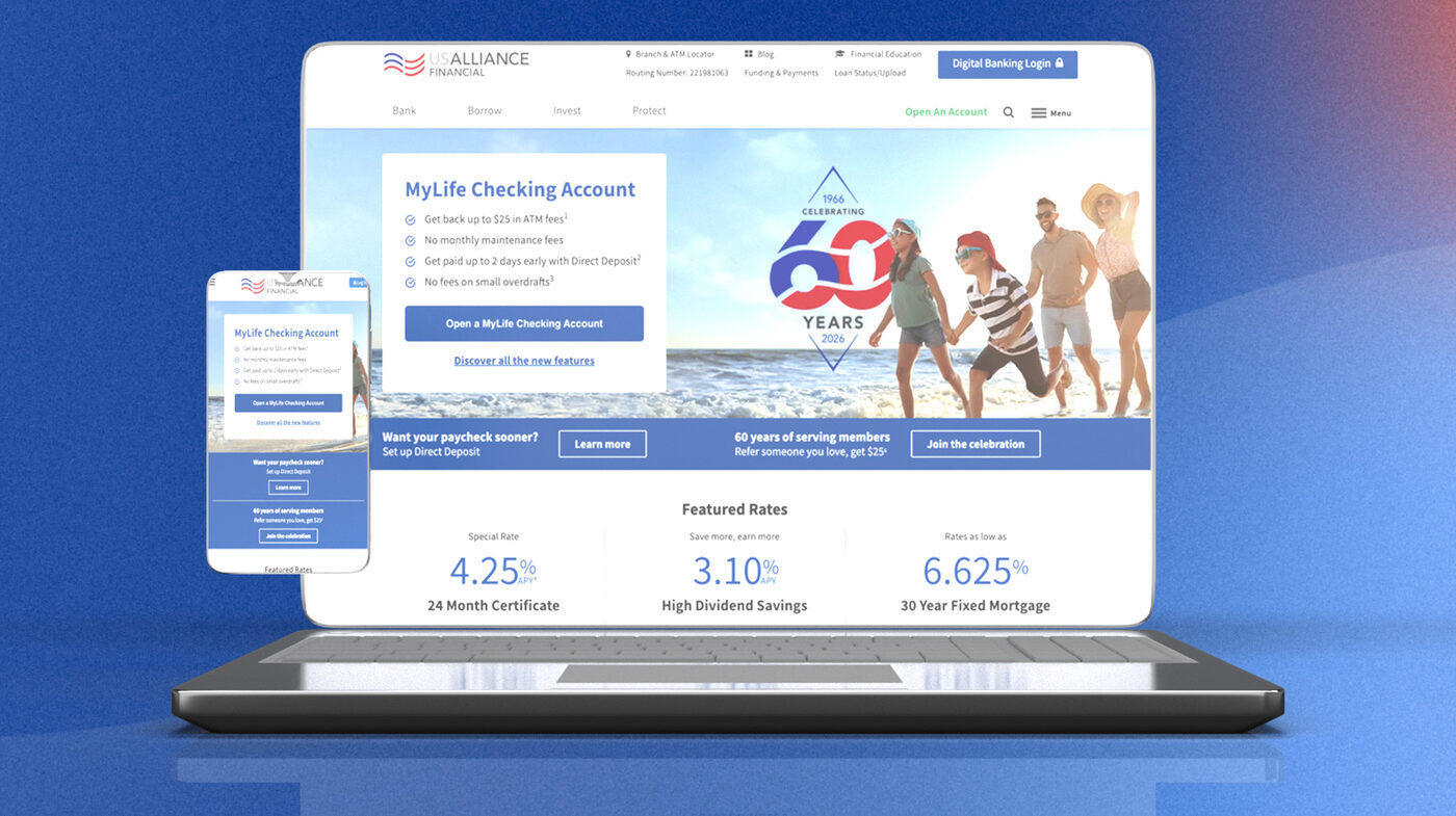
I spent the past year as Web Designer and acting Creative Team Lead for USALLIANCE Financial — a 190,000+ member credit union that's been around since 1966 and, brand-wise, still had a bit of a bell-bottoms situation going on. The job: a full brand system, growth campaigns, email automation, and onboarding personalization, at the scale of a full digital team — played, in this case, by one person and a lot of coffee.
Web Designer & Acting Creative Team Lead (plus a one-year stint as Interim Marketing Ops, because someone had to)
Since January 2025 — ongoing
Me, plus a Marketing Designer, Marketing Ops Specialist, Marketing Coordinator, Creative Director, VP of Growth Marketing, Copywriter, Data Analyst, and UX Architect — with Digital Banking & Innovations, Compliance, and Legal on speed dial
Figma, Adobe Suite, HubSpot, LogRocket, Microsoft Clarity, Zappy, Medallia, Experian Mosaic
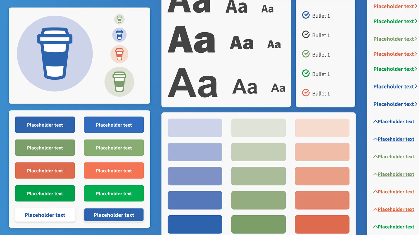
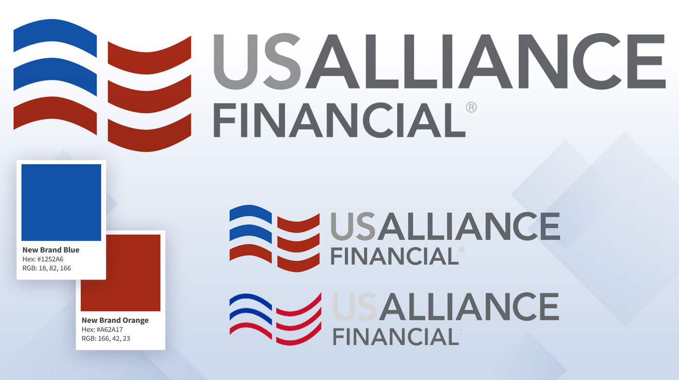
USALLIANCE is 60 years old and, until recently, had never had an actual design system — which for a brand that age is basically the marketing equivalent of never going to the dentist. Every product line (checking, savings, certificates, loans) had picked its own color at some point, which diluted brand recognition and worked against a core business goal: getting members to actually use more than one product. The palette had crept up to 94+ colors and shades — an accessibility nightmare, a consistency nightmare, and a nightmare for whoever had to open that Illustrator file.
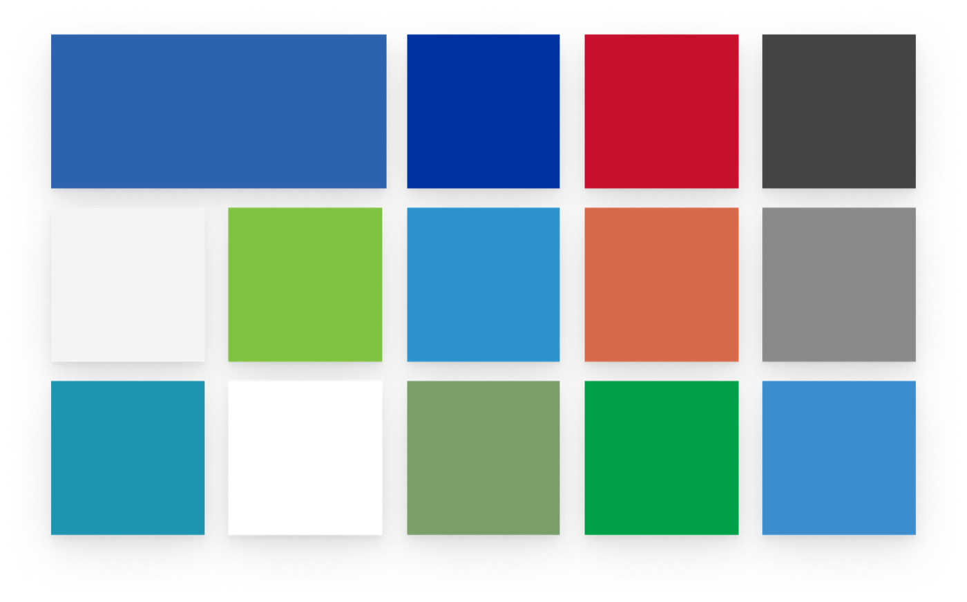
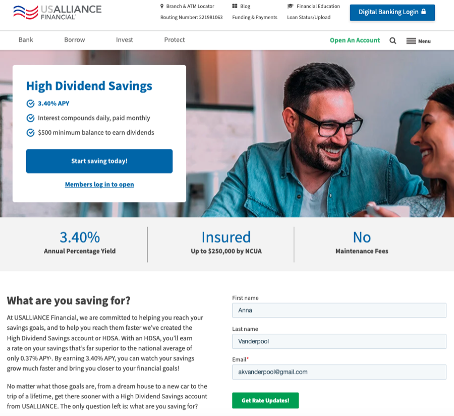
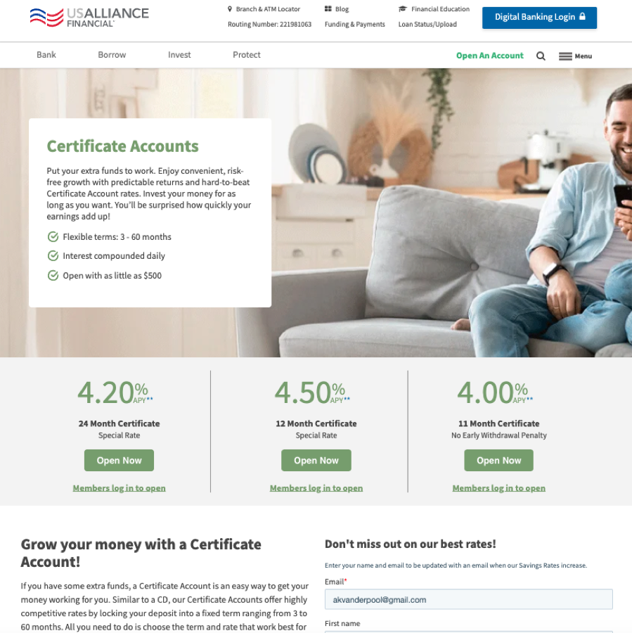
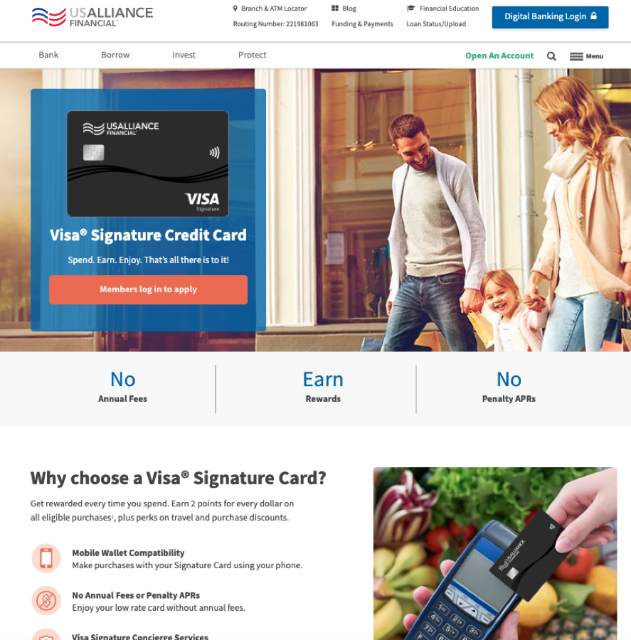


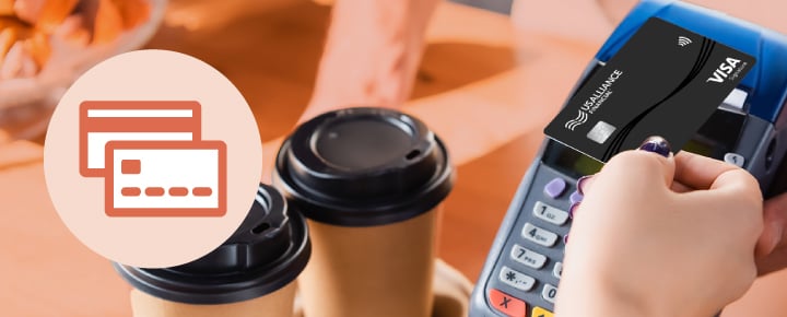
Same template, three different brands: each product page and banner had its own color, so nothing read as one family.

The old typeface (Franklin Gothic URW) had a real glitch, too: at small sizes, a lowercase "i" and "l" basically blurred into one line — which is exactly the size range I live in for compact email layouts and fast-loading assets. The logo had poor contrast against colored or photo backgrounds, so in practice teams defaulted to a flat white version that carried none of the brand's actual personality. And the last brand guide was written in 2018 — long, dense, and about as followed as a New Year's resolution.
There's also a trust thing that's specific to financial brands: inconsistency reads as risk. Nobody consciously clocks a 2px‑vs‑3px button radius, but small sloppiness quietly chips away at "yes, this is a legitimate place to keep my money."
I designed — and single-handedly implemented — a full design system: color tokens, typography, spacing, and component patterns, engineered for both accessibility (targeting AAA-level WCAG contrast) and brand clarity. Colors moved from "a color per product" to one deliberate brand palette. Clean, global code modules and templates mean the whole brand now updates from one source of truth, instead of getting hand-matched page by page.
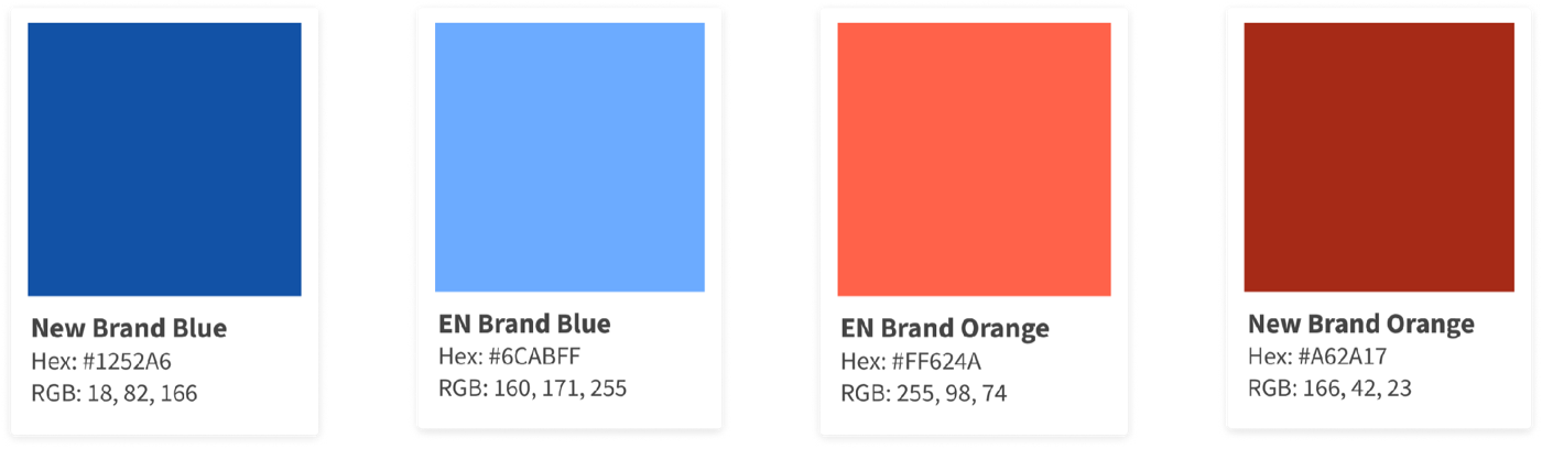
Typography got the same treatment. Our Marketing Designer and I explored replacements together, and Poppins came out ahead: clean, geometric, and legible at the small sizes where Franklin Gothic fell apart. It's replacing Franklin Gothic across the new templates. The Marketing Designer also led the new gradient and pattern work that sits on top of the palette.
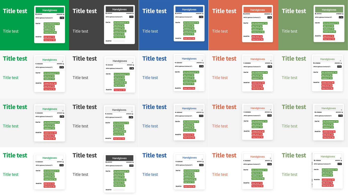
WCAG has three conformance levels — A, AA, and AAA — and most companies design toward AA (a 4.5:1 contrast ratio for normal text), since that's the legal baseline referenced by the ADA and most accessibility lawsuits. I pushed for AAA instead (7:1 for normal text, 4.5:1 for large text). For a financial brand specifically, that one decision did real work beyond compliance: higher contrast is what let us cut the 94-color sprawl down to 24 deliberate color variables, since low-contrast pairings simply weren't eligible anymore. It also improves legibility for older members and members with low vision — a meaningful share of a credit union's base — without needing a separate "accessible mode." And AAA-level contrast happens to be one of the signals accessibility-aware SEO crawlers and Lighthouse-style audits reward, so the same fix that made the brand more legible also nudged our technical SEO score up.
I ran the old palette through full contrast-ratio testing first, so I wasn't just showing up with "trust me" — I had the receipts.
Rather than redesign pages in isolation — the UX equivalent of rearranging deck chairs — I mapped and rebuilt two full member journeys against the new system:
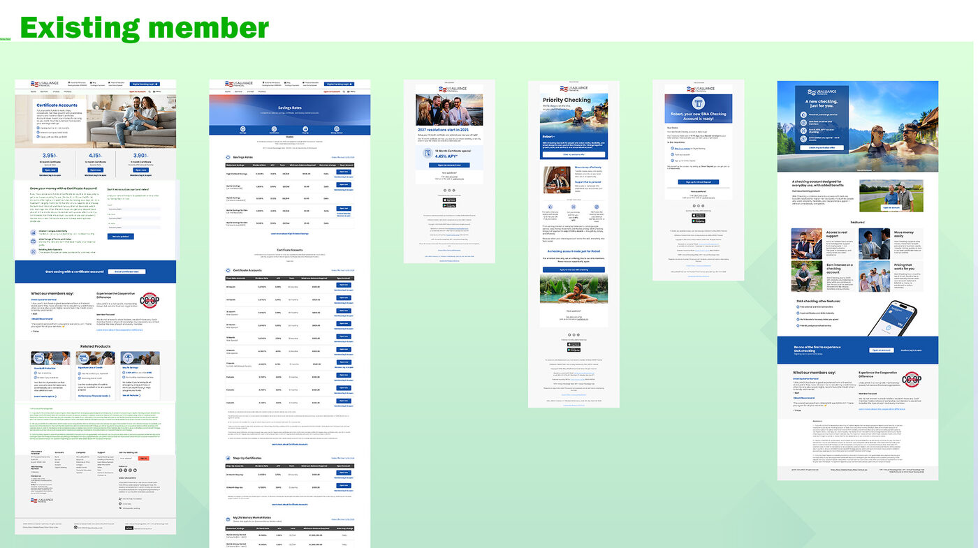
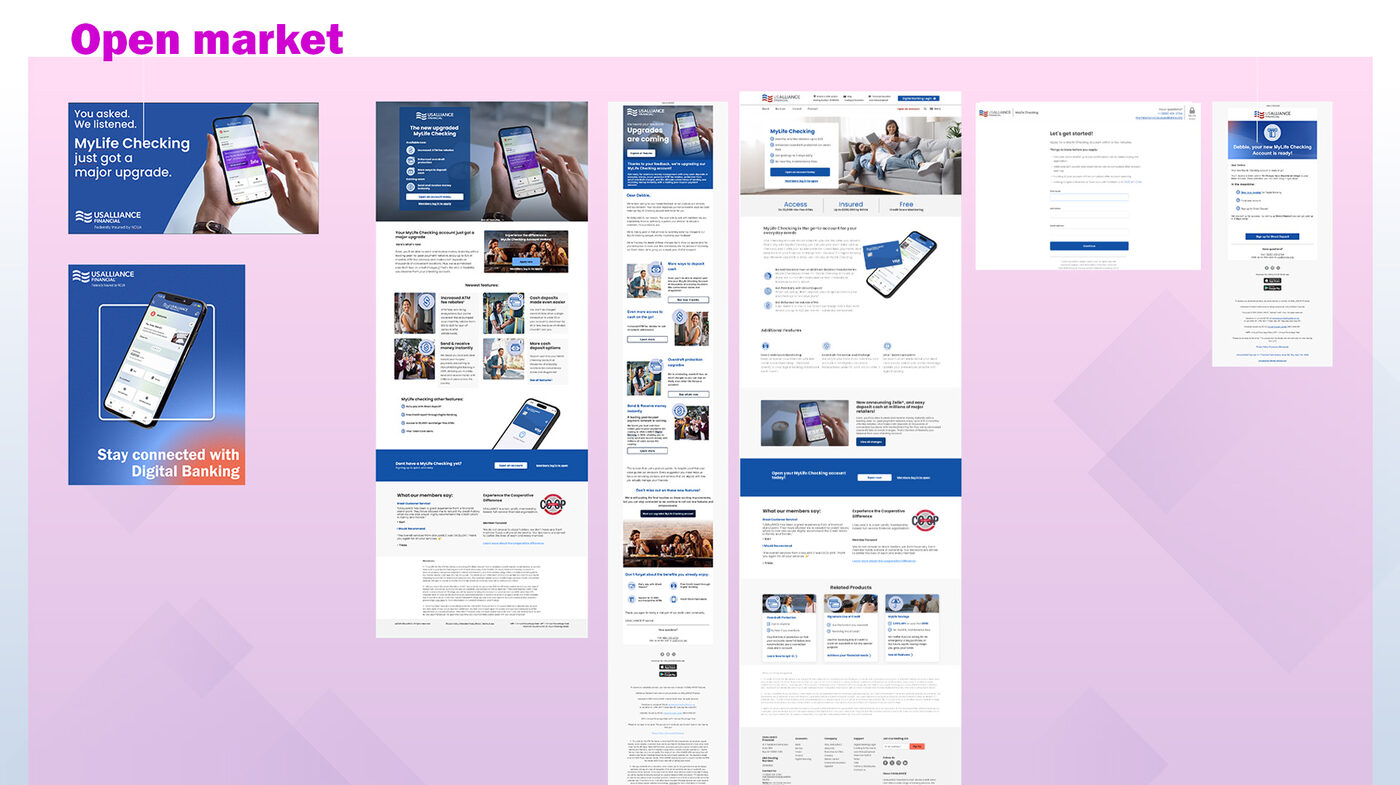
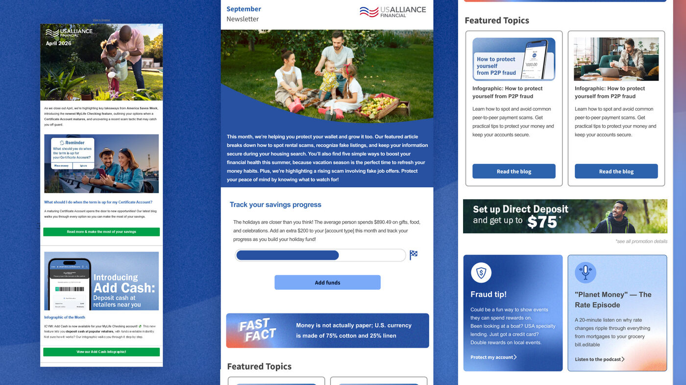
The full brand system soft-launches September 7 alongside the redesigned newsletter, so the member-facing metrics are still young. What's already gone live on social picked up a 22% increase in engagement — I'll update this section with the real post-launch numbers once the rollout has had time to breathe.
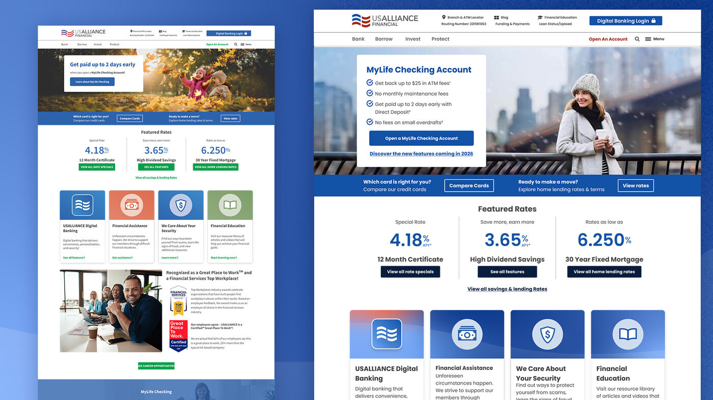
What started as a brand refresh turned into a full redesign of the website. With the new palette and type in place, the templates themselves were the next thing holding the brand back: dense, boxy, and built around a navigation most members didn't understand. This work is currently in concepting, prototyping, and testing on select pages.
I ran click heatmaps on the homepage in Microsoft Clarity. The pattern was clear: members came in, went straight to Digital Banking Login, and left. The rates, product tiles, and promotions further down the page were barely getting touched.
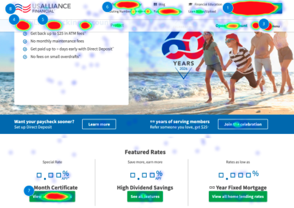
I don't want to make login harder to find. For most members it's the reason they visit, and it should stay one click away. But the goal for the redesign was to give members a reason to stay for more than two seconds, so they actually see the products and promotions we're offering before they head into digital banking.
USALLIANCE members hold an average of just 1.38 products each. That means most members never experience the full suite of checking, savings, certificates, cards, and loans the credit union offers. Part of that is navigation: "Bank / Borrow / Invest / Protect" is how a financial institution organizes itself, not how an average person thinks about their money.
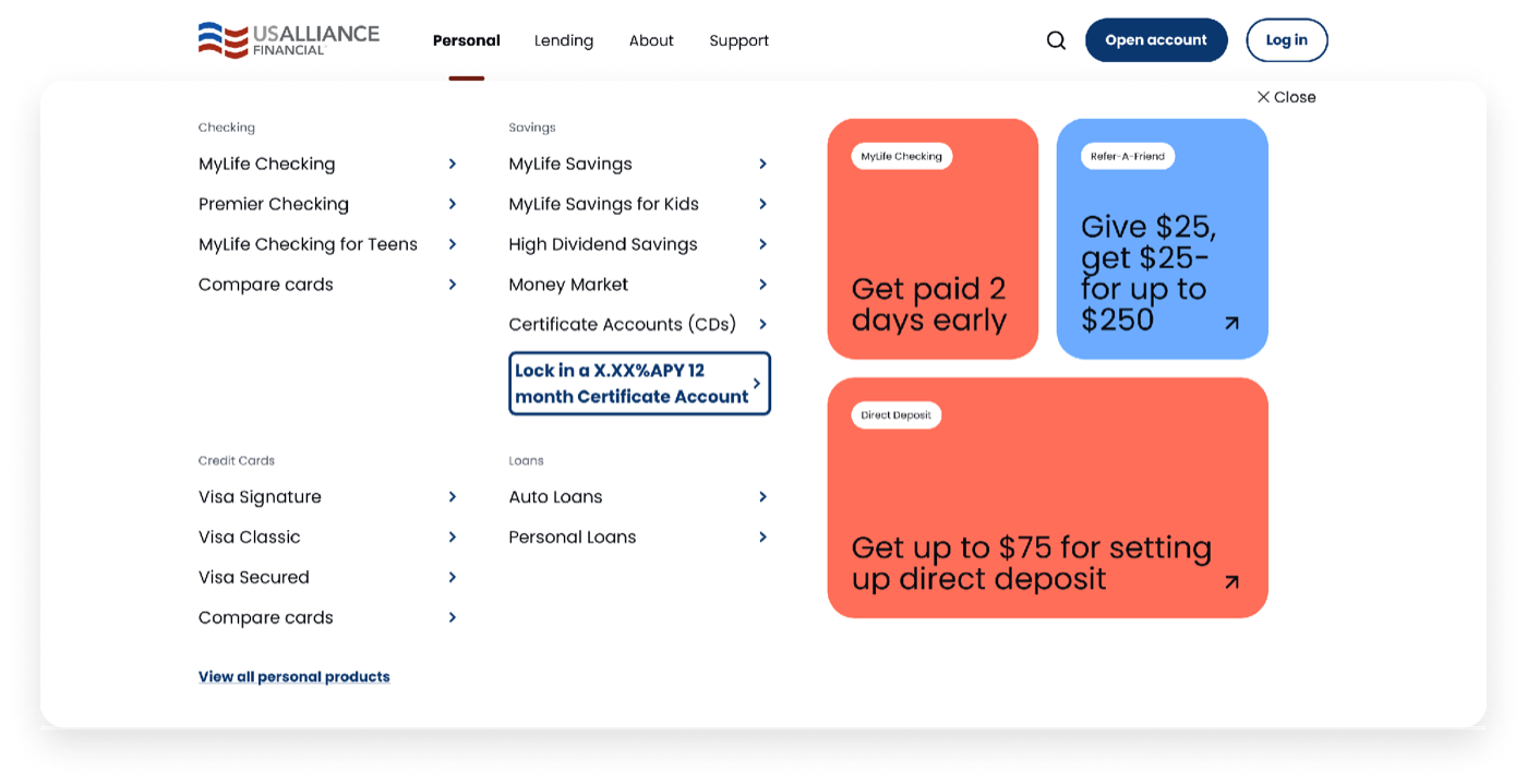
So I bundled the products into fewer, more approachable topics, like "Personal" and "Lending," and gave the mega menu room for live promotions. Now, when a member opens the menu to find one product, they also see what else is on offer, like getting paid two days early or earning up to $75 for setting up direct deposit.
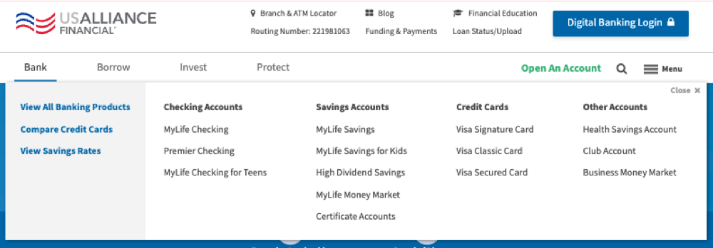
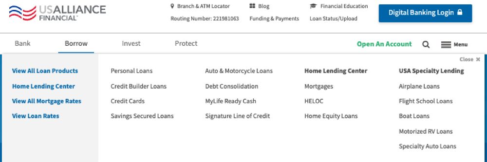
Before: the old Bank and Borrow menus, which were long lists of links organized the way the credit union is structured internally.
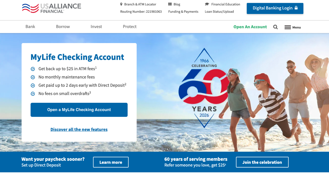
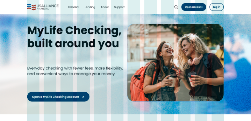
The new templates trade the boxed-in hero and heavy blue bars for open space, rounded imagery, and a clear grid, with Poppins and the new palette doing the brand work. Each one is mocked up in Figma first, then built out in HTML and CSS (with some help from Claude) so we can prototype and test on real pages.
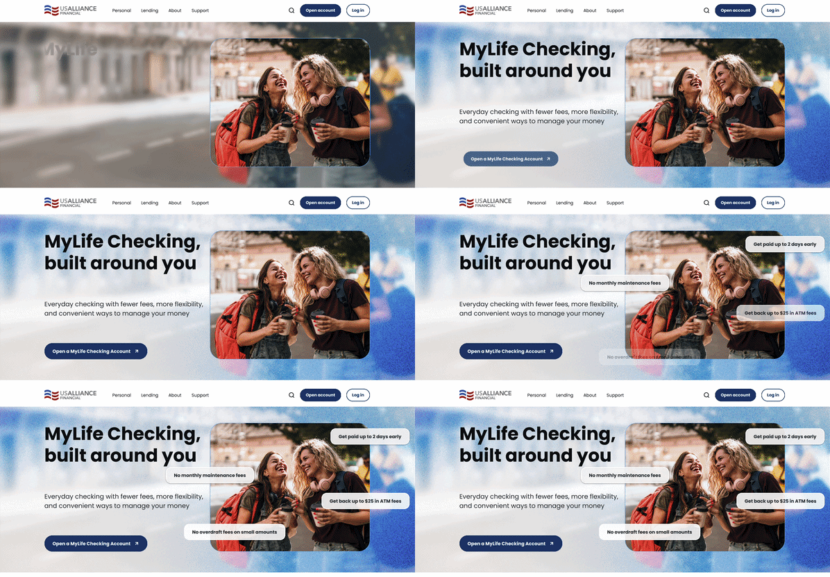
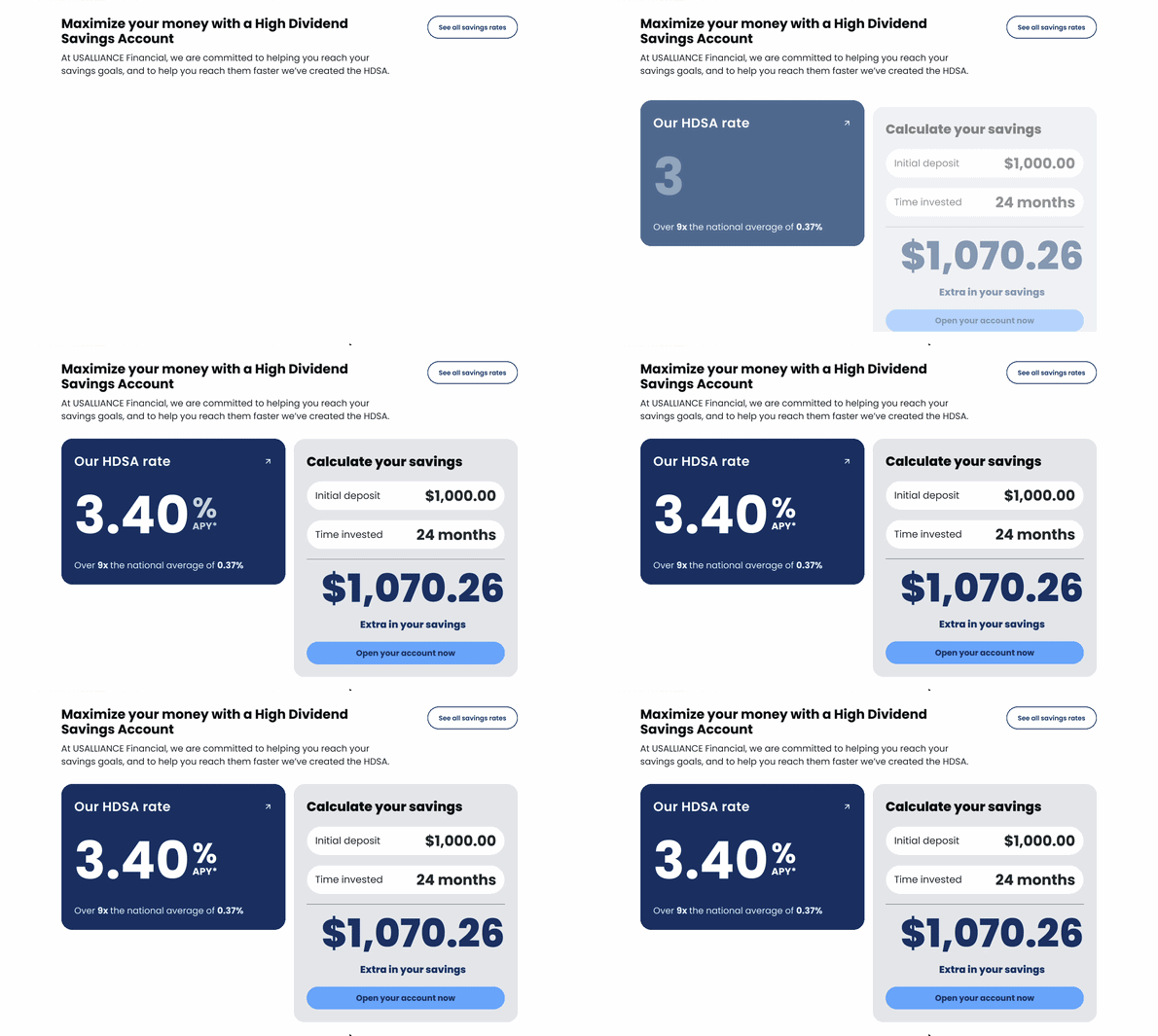
I added motion to the new templates for two reasons. The first is engagement and time on page. Nielsen Norman Group's analysis of Microsoft Research dwell-time data found the first ~10 seconds of a visit are when people decide whether to stay or leave. And Google's own testimony in the DOJ antitrust trial confirmed that user-interaction data (clicks and what happens after them, via its NavBoost system) feeds into search rankings. Google hasn't confirmed time on page as a standalone ranking factor, so I don't treat it as one. But keeping people engaged long enough to find what they need is the kind of satisfaction signal search rewards, and it's exactly what the heatmap said we were missing.
The second reason is simply that it makes the experience more engaging and fun for members. The motion stays deliberately gentle: soft fade-ups that draw the eye to products and rates without pulling attention away from what we want members to do.
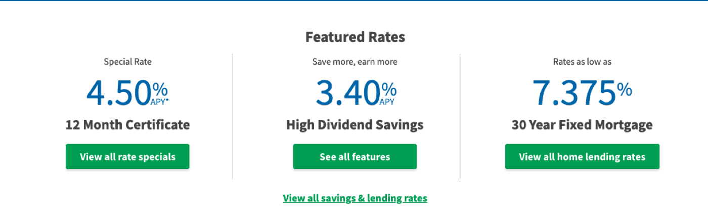
The old "Featured Rates" bar put three products side by side in the same size, weight, and color. Nothing stood out, so nothing got attention, and a member skimming toward the login button scrolled right past all three.
For the redesign, I replaced it with a deep dive on one product at a time, starting with our High Dividend Savings Account. The rate gets its own card, big and bold at 3.40% APY, with the context right beneath it: over 9x the national average of 0.37%. Next to it sits an interactive savings calculator. Members enter an initial deposit and a time frame and see what they'd actually earn, with the "Open your account now" button right below the result.
A percentage is abstract, but "$1,000 becomes $1,070.26" is real money. The calculator turns the rate into something personal, and it gives members a reason to stop, interact, and spend time with the product. That was exactly what the heatmap showed we were missing.
MyLife Checking targets "Debit Debbie" — an underbanked, emerging-city single who lives on her debit card — plus first-time Gen Z members who've never used a credit union before. I owned the whole stack here: landing pages, email sequences, personalization logic, and sign-off on every piece of copy and print.
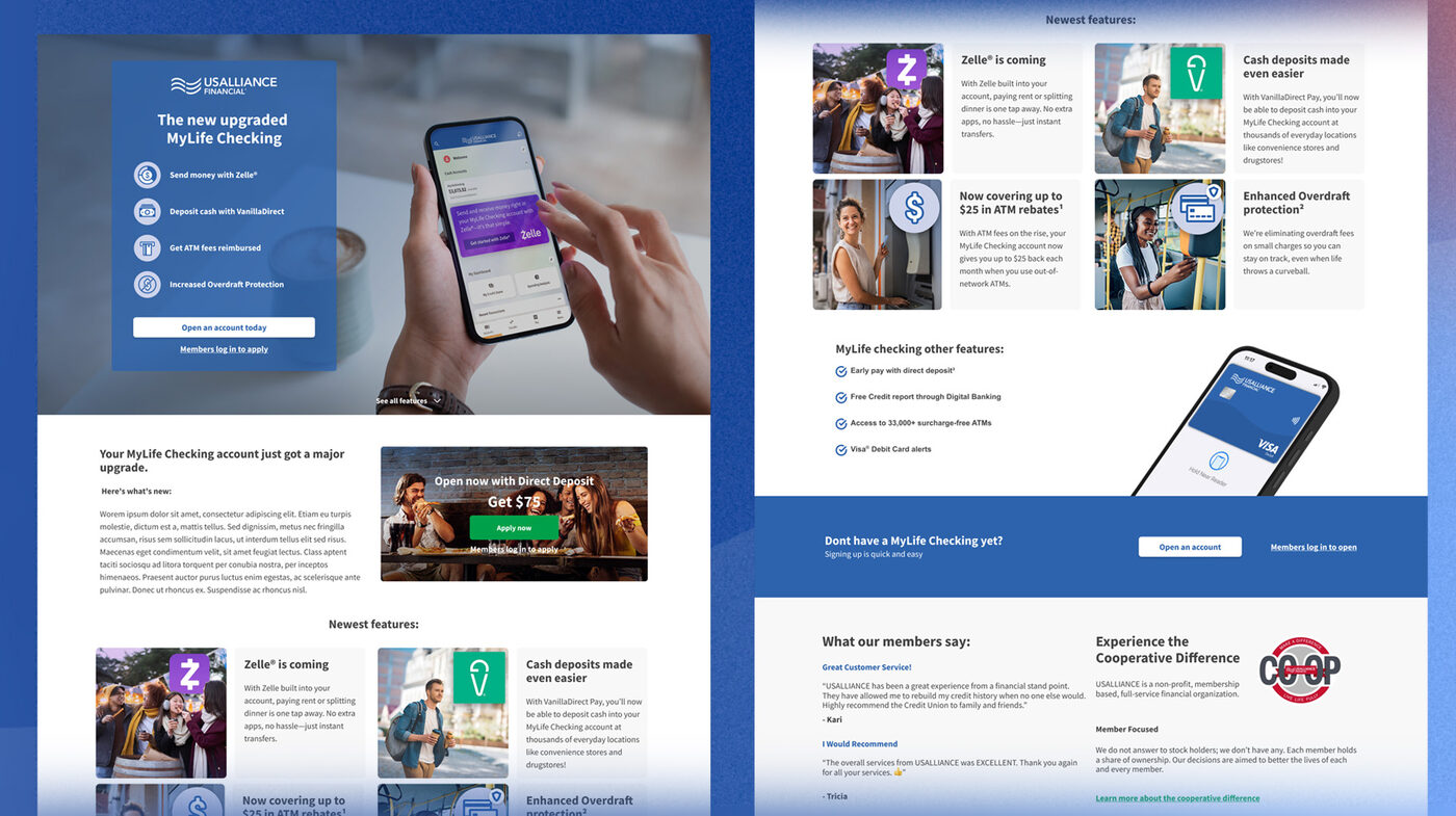
The account itself got real upgrades, not just a paint job: Zelle integration, ATM rebates bumped from $10 to $25/month, an "Add Cash" feature (Vanilla Direct-Pay), overdraft grace up to $5, and a rebuilt new-member application. I built a dedicated new-features landing page to introduce the whole refresh in one place, instead of making members go product-page spelunking to piece it together themselves.
Registrations stalled hard — 38 out of about 1,200 targeted members in the first week. I dug in and found fee aversion was the real culprit: a $3 transaction fee was scaring off the exact segment we'd targeted. My fix was simple — waive it for Direct Deposit members. The catch: key leadership wasn't even in the room when I presented it. Pitched it anyway, got it approved, and it shipped.
Leadership wasn't in the room for that recommendation — but the work didn't stop. This is what it looks like to move things forward independently.
Pulled straight from the HubSpot report: the campaign shows $1,269.44 in attributed revenue — though no budget or spend was ever logged in the campaign setup, so a true ROI or cost-per-registration figure isn't calculable yet from this data alone (a marketer's nightmare sentence if there ever was one). On reach, though, it's influenced 8,974 contacts — a solid audience for something this new. Most of the performance lives in email: across 6 published emails, the campaign generated 10,774 sends, 4,300 opens, and 95 clicks, for a 4.03% aggregate click rate by HubSpot's own math. Two lists covering 8,399 contacts round out the asset mix — 8 assets total, all built, with no landing pages, forms, social posts, or ad assets tied to this specific campaign object. The published emails cover registration, completion, feedback, and early-access — which maps cleanly onto a feature-launch lifecycle, even without a dedicated landing page of its own.
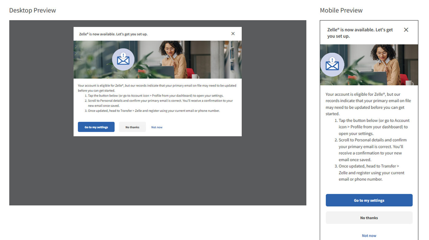
Launch day arrived with a surprise: roughly 5,000 members had invalid emails on file, so their registration emails were bouncing and they couldn't enroll. I got on the phone immediately with the Manager and VP of Payment Operations, the Chief Marketing & Experience Officer, and the VP of Digital & Innovation. Drawing on what I knew of the HubSpot platform, I proposed a login interstitial targeted by member ID, handed the creative build to our Marketing Designer and Communications Specialist, and the team pulled it off — all inside a 2-hour window, on the same day as our annual report meeting. No pressure.
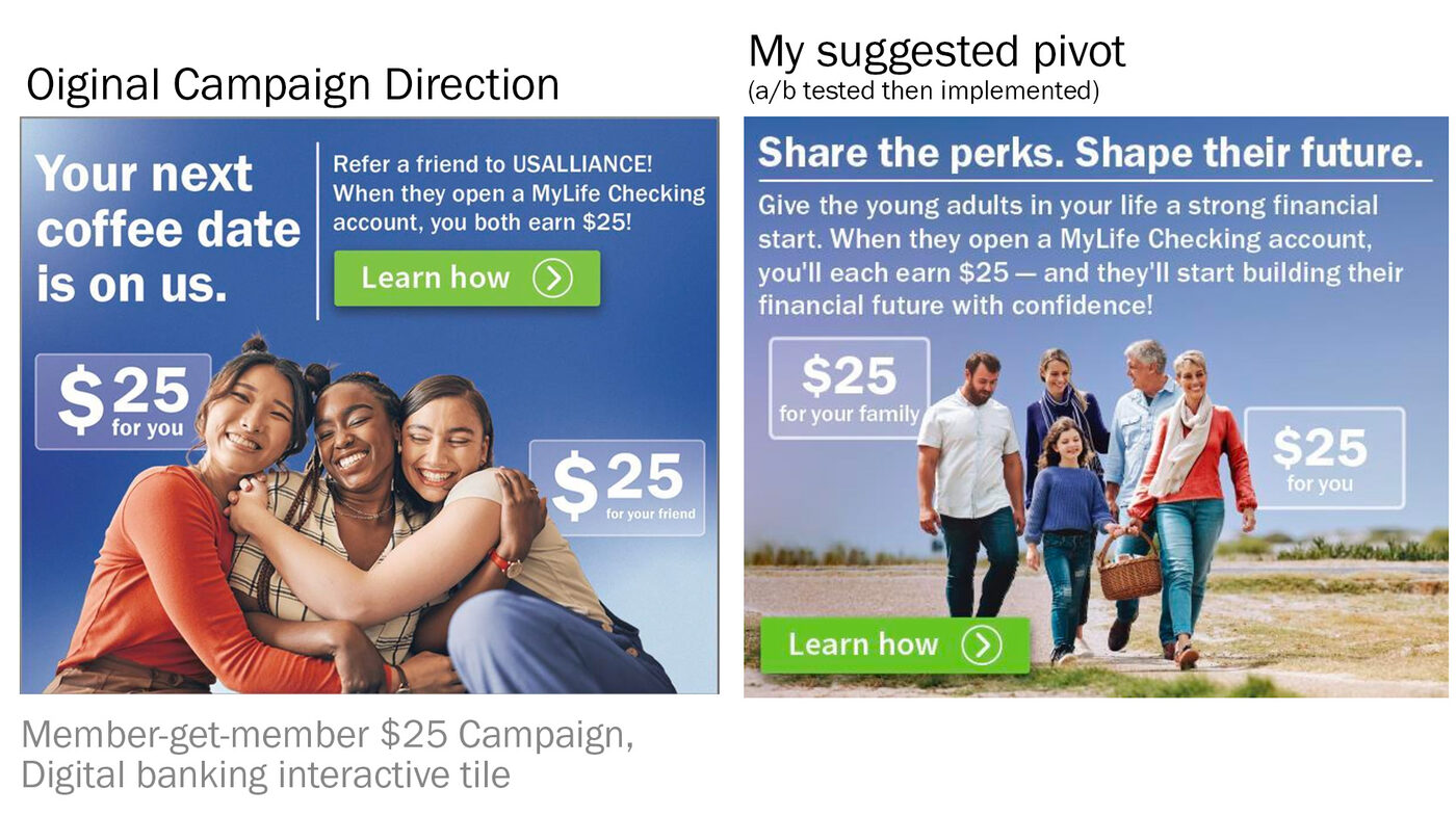
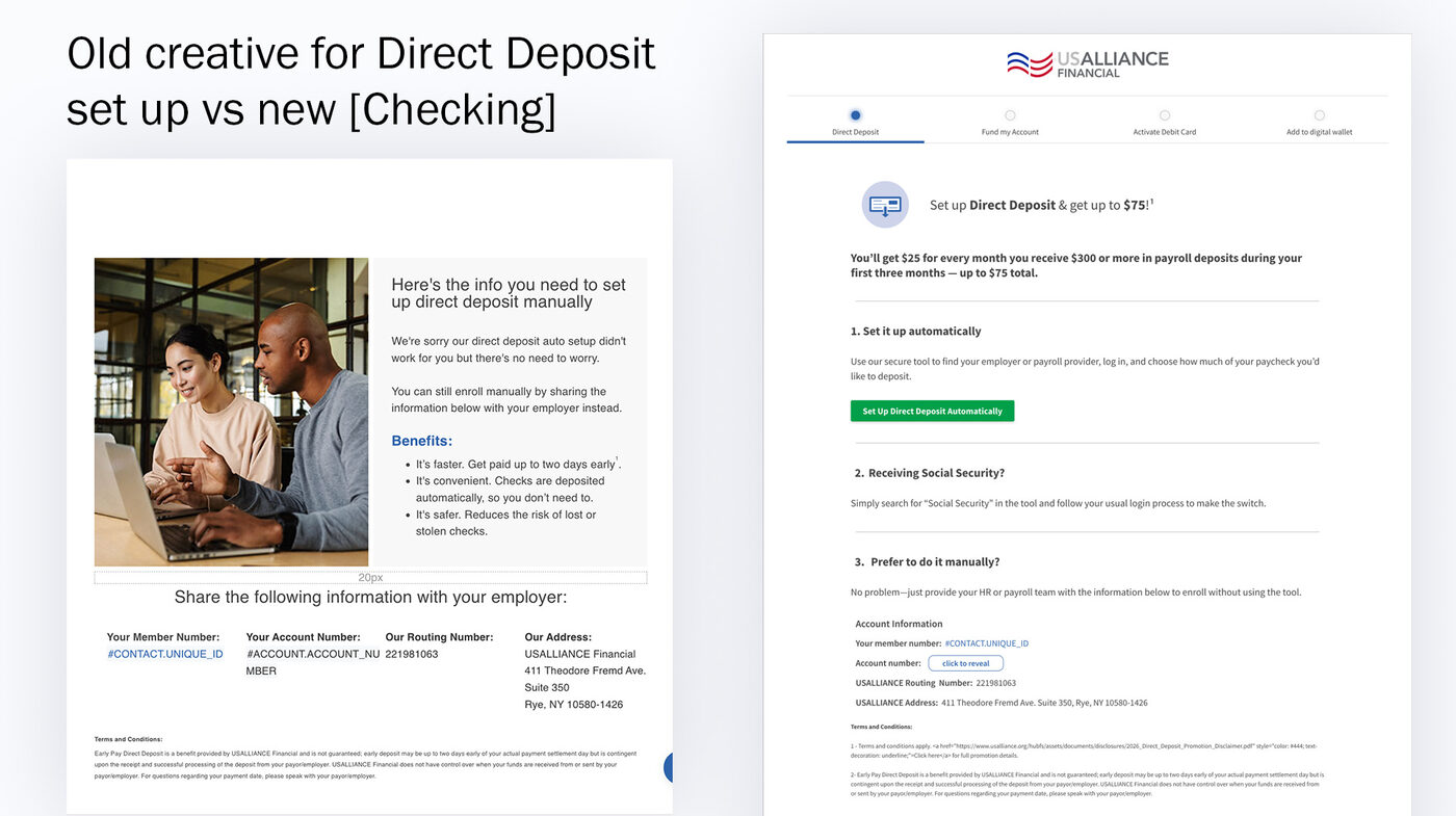
An incentive nobody knows how to claim doesn't do much good. I built a dedicated Direct Deposit landing page to walk members through setup step by step, alongside the MyLife Checking features page driving the broader campaign.
Full campaign: 542 deals attributed, $13,235,576.41 associated deal value, 286 contacts. Direct Deposit LP: 32 deals attributed, $1,042,934.90 associated deal value, 21 contacts.
We kept A/B tests running across the funnel — subject lines for open-rate wins, email copy for click-throughs, hero imagery on the site — each tailored to whichever personalized feature that particular member was seeing.
For context: financial institutions lose an average of 3.36 abandoned digital applications for every one completed account (Cornerstone Advisors / Alkami, 2026 Digital Banking Performance Metrics report), and members who set up Direct Deposit within their first 30 days are 76% more likely to be digitally engaged a year later (MX Technologies). This gap is not a small thing.
USALLIANCE has a wide spread of products, each with its own funding method, timeline, and cross-sell logic — but every new member, no matter what they'd opened, got funneled into one generic "All New Member" journey. It auto-completed after 3 days whether or not the member had actually converted, then checking-account members got handed off into a second, checking-specific journey for up to 20 more days. That handoff created a seam where conversions could quietly get lost or double-counted, and the all-products landing page had ballooned to 5,000+ words trying to cover every path at once — including, at one point, prompting someone who'd just opened a certificate deposit to set up Direct Deposit. Which, for a certificate, makes about as much sense as it sounds.
Working with our UX Architect, and using quarterly NPS feedback plus dynamic targeting from our core banking data, I mapped the ideal journey per product and rebuilt onboarding as one continuous, product-specific flow. Checking-account openers now go straight into a single "Onboard: Checking" journey — 25 days, tailored content, room for product-specific promos, zero handoff seam. It also gave us clean, product-level analytics for the first time ever, including a brand-new "account funding" objective the old flow never even tracked.
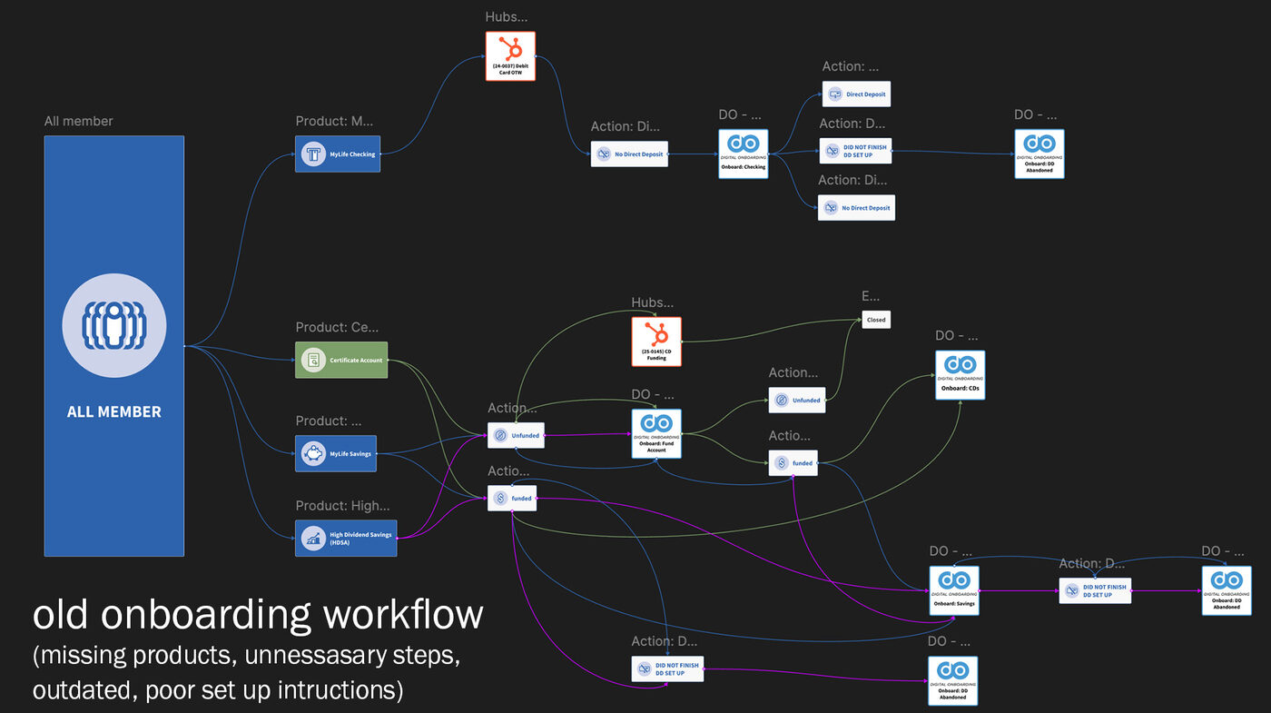
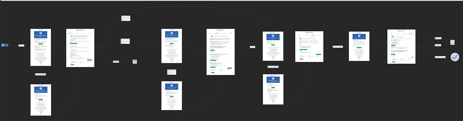
The new journey has only been live 67 days as of this write-up (756 journeys sent, 44.7% still in progress) — so these are early, probably-conservative numbers, not the final read.
Alongside everything above, this is what I own and keep running week to week across USALLIANCE's 190,000+ member base — the unglamorous, extremely necessary stuff.
Input from a wide range of departments — payments, lending, member services, execs, the board — is genuinely valuable, but it can also pull a project in five directions at once. The fix that actually worked: assigning one clear primary stakeholder voice per project. Kept communication sane and the vision coherent.
High-visibility, high-impact work means delays happen sometimes — that's just true. Next time, I'd build in clearer checkpoints and automatic status updates up front, instead of letting silence do the anxiety-inducing work that a two-line update could've handled.