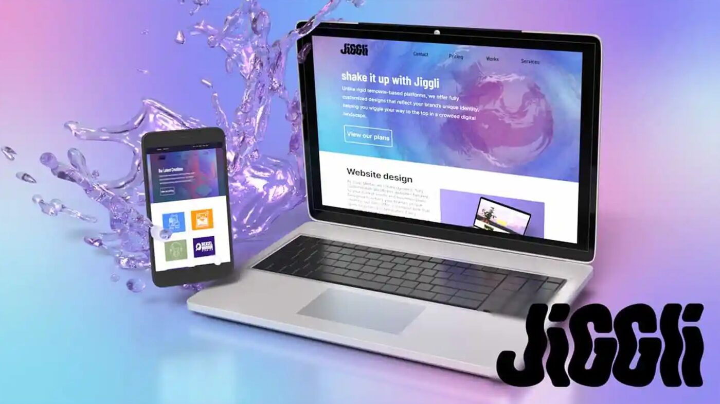
Jiggli Media is a web design studio that spun out of Winky Hosted, a WordPress hosting company I'd been under contract with since 2021. When the founders decided the design side deserved its own identity in 2024, I got to be there for the fun part — the ground floor. I ended up owning nearly the entire brand that resulted: naming, strategy, a mascot, visual identity, motion graphics, and the full website build, live today at jigglimedia.com. No creative director, no handoffs — just me, a blank page, and an unreasonable number of browser tabs.
Brand Strategist, Lead Designer & Developer
Co-branded venture, spun out from Winky Hosted
Contracted with Winky Hosted since 2021; Jiggli Media founded 2024
Naming & brand strategy, mascot design, logo, brand guide, social/motion assets, Figma mockups, Webflow prototype, WordPress build
Figma, Webflow, WordPress, Illustrator, Photoshop, After Effects, Premiere Pro, Sketch, JavaScript, CSS, HTML
Winky Hosted's core business is WordPress hosting, but the web design work kept growing alongside it — enough that the founders wanted to give it a separate identity instead of letting it live as a feature buried inside a hosting brand. I'd already been working with the team since 2021, so when Jiggli Media was founded in 2024, I was in the room for the ground-floor work: naming, positioning, and style direction for what the new studio should actually be, not just what it should look like.
From there, the scope became "build it from scratch, almost entirely on your own" — a genuinely different kind of project than a refresh. There was no old palette to fix, no legacy site to migrate off of, no established voice to protect or work around. Every decision — the name, the mascot, the motion language, the code itself — started from a blank page. Equal parts terrifying and the best kind of creative freedom.
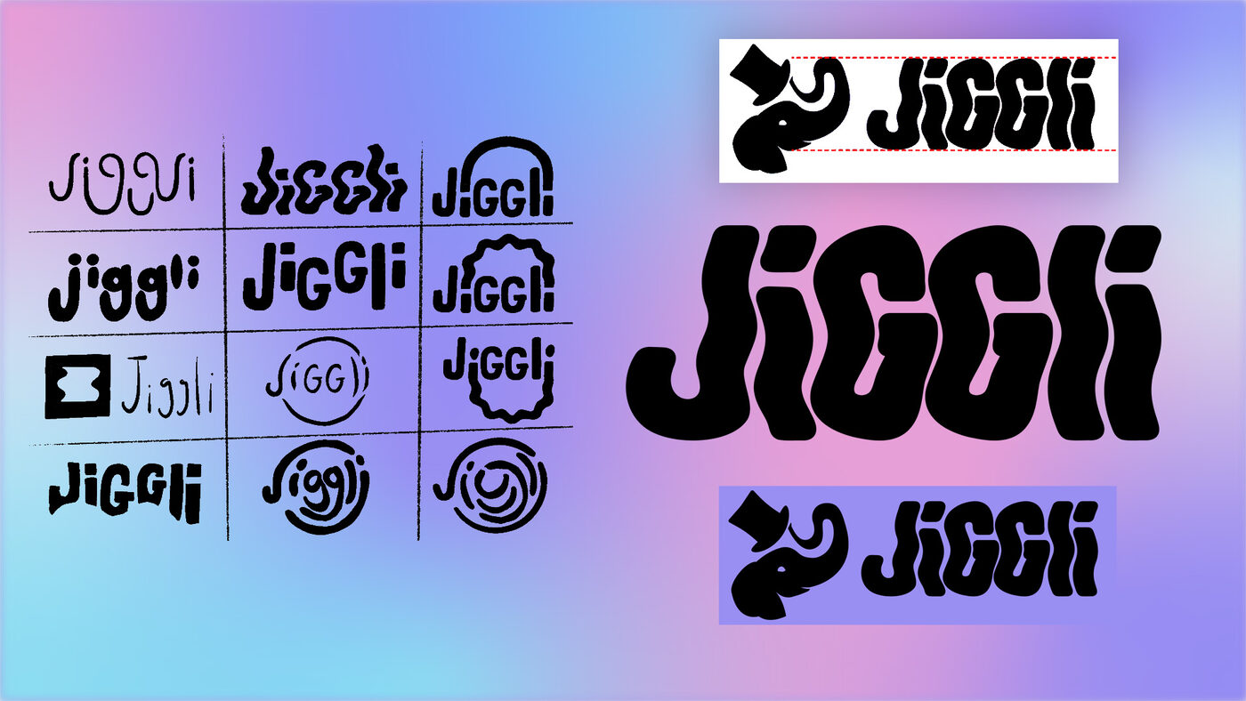
Naming and direction came out of a collaborative ideation process with the founders. "Jiggli" won the room because it unlocked an entire visual language for free: jiggly, shaking, watery movement that reads as playful without tipping into unserious — a good way to stand out from the sea of navy-and-sans-serif agency branding out there.
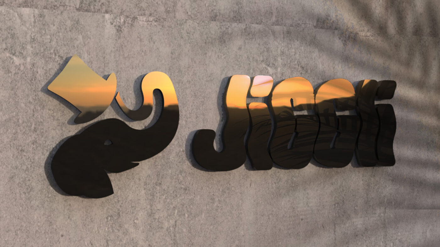
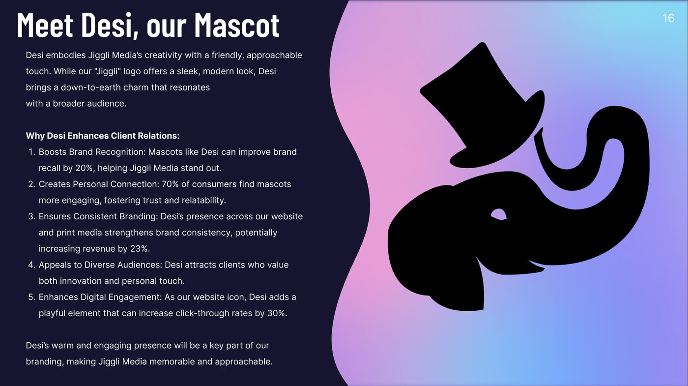
Early on, I actually went and checked whether a mascot moves the needle for a brand, instead of just assuming a cute animal would help because cute animals are fun to draw. System1's four-year study of Super Bowl ads found that spots built around a brand character scored meaningfully higher and drove stronger recall than celebrity-led ads, and industry data on recurring brand devices shows they're substantially more likely to drive a real profit lift, not just a chuckle and a scroll-past. That research is cited directly in the brand guide — it's why a mascot went into the brand from day one instead of getting bolted on later as an afterthought illustration.
Desi was designed to actually earn that job: built to show up alongside the logo across as much of the brand as possible, not live as a one-off mascot nobody remembers past the homepage.
The website's hero is a custom 3D animation I built in After Effects and Premiere Pro: a rippling water surface with Desi standing on it, then a ripple transforms Desi seamlessly into the Jiggli wordmark before looping back to the start with no hard cut. It's the "jiggly/shaking" concept made completely literal, and it's the very first thing anyone sees on the site — no easing into it, no "welcome to our website" text wall first.
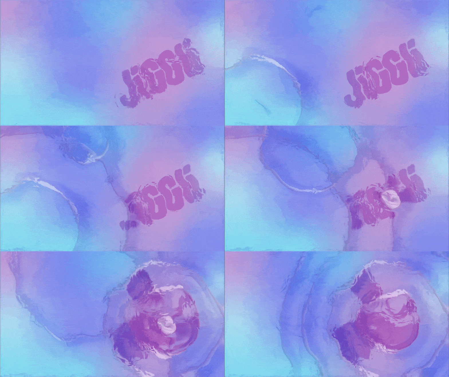
Watch the full 3D hero animation on YouTube →
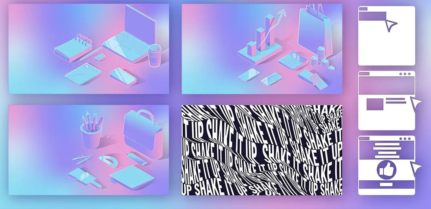
Beyond the hero, I built a set of custom motion graphics and GIFs used throughout the landing page and portfolio sections — small, purposeful animation rather than decoration for its own sake, reinforcing the same watery/shaking motion language everywhere it shows up so the brand feels like one system instead of a hero animation with some static pages bolted on after.
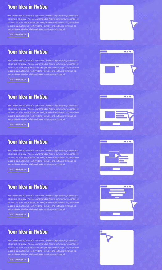
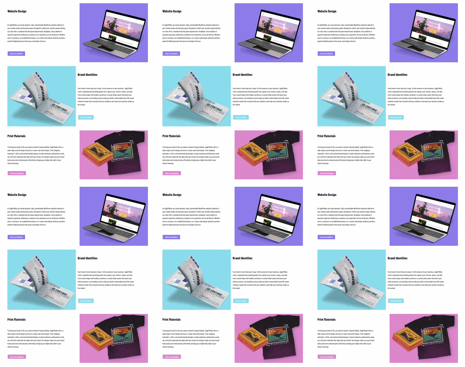
Not every animation needed After Effects. The service sections use subtle hover animations I built with HTML, CSS, and JavaScript. They're lightweight, respond to the visitor, and keep the "shake it up" energy going without slowing down the page.
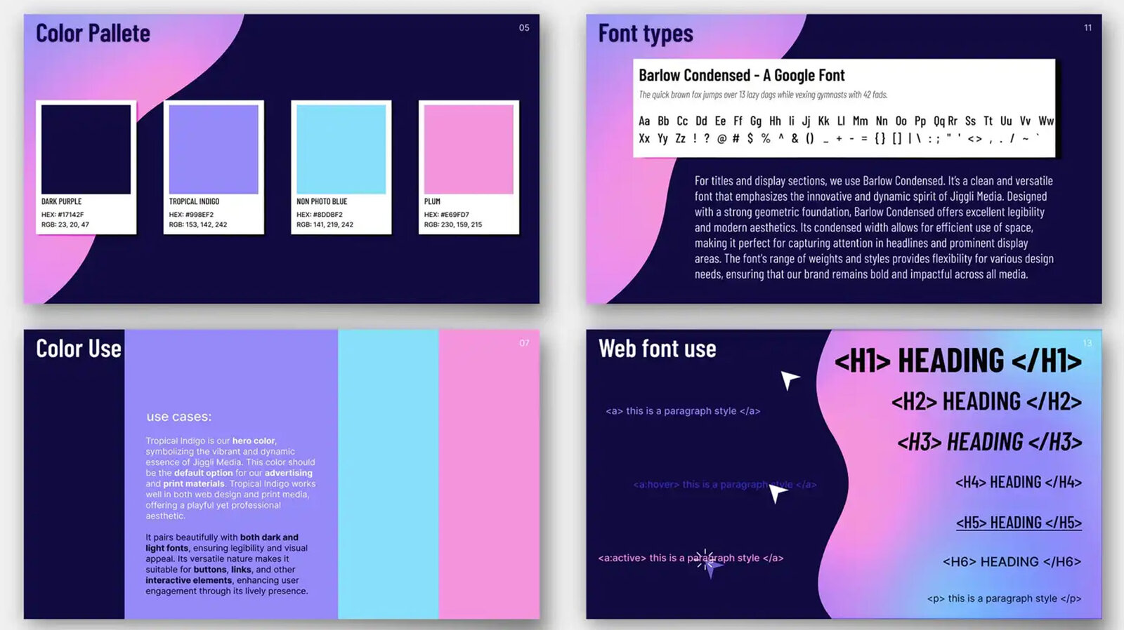
I owned every layer of the build myself, with zero handoff between stages: ideating with the team to land on direction, then Figma mockups, an interactive Webflow prototype to pressure-test layout and motion, and finally implementing the live site in WordPress so the team could manage content independently after launch. Nothing got lost in translation between design intent and the working site, because the same person carried it through every single stage — for better or worse, all bottlenecks were also just me.
Live and accurate to this work at jigglimedia.com.
A brand isn't finished once it's live — it has to actually go out and win work. Below is a personalized outreach email I designed for a prospective client, a café in Peekskill, written and styled entirely in Jiggli's own voice and visual language, right down to the "jiggly" wordplay in the subject line. It also puts the brand's own track record to work as social proof, referencing a real result from another Jiggli project — a 35% lift in reservations — directly in the pitch. Nothing sells a marketing studio's capabilities like marketing itself well.
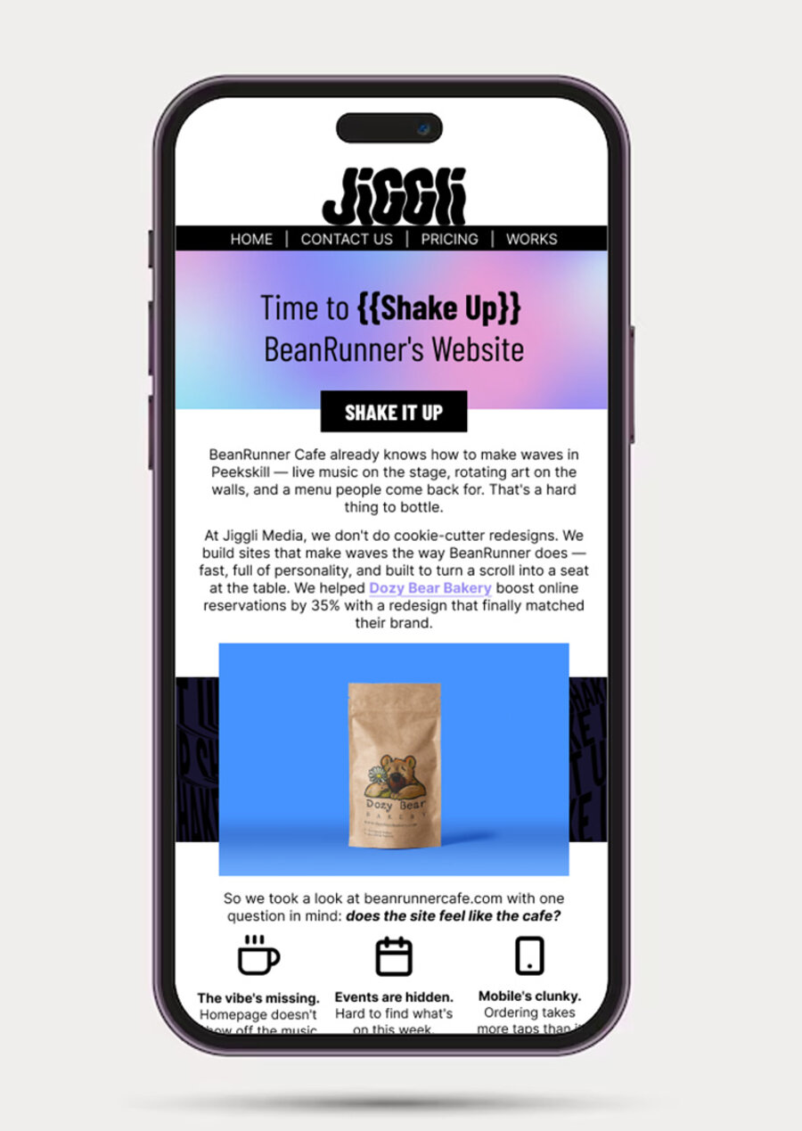
The subject line puns on "shake up" (obviously), the CTA button matches the site's own black-and-white "shake it up" pattern, and the body copy leads with specifics about the café itself — live music, rotating art, a menu people come back for — before ever mentioning Jiggli. Then it gets concrete: three named problems (the vibe's missing, events are hidden, mobile ordering is clunky), backed by a real number from a comparable project.
Takeaway: cold outreach works a lot better when it reads like it was written for one specific business, not copy-pasted at fifty of them.
This is the project where I wore every hat at once: brand strategist, namer, illustrator, motion designer, and developer, on a brand that's now out in the world generating and winning its own leads. Unlike a redesign, there was no existing identity to lean on or push against — every decision, from the mascot to the motion language to the code itself, had to be justified and built from nothing.
The mascot decision in particular is a good example of how I like to work: not defaulting to "a mascot would be fun," but actually checking what the research says a mascot does for recall and trust before committing a brand's core identity to one. That same instinct — grounding a creative decision in something more than taste — shows up across all three of these case studies.