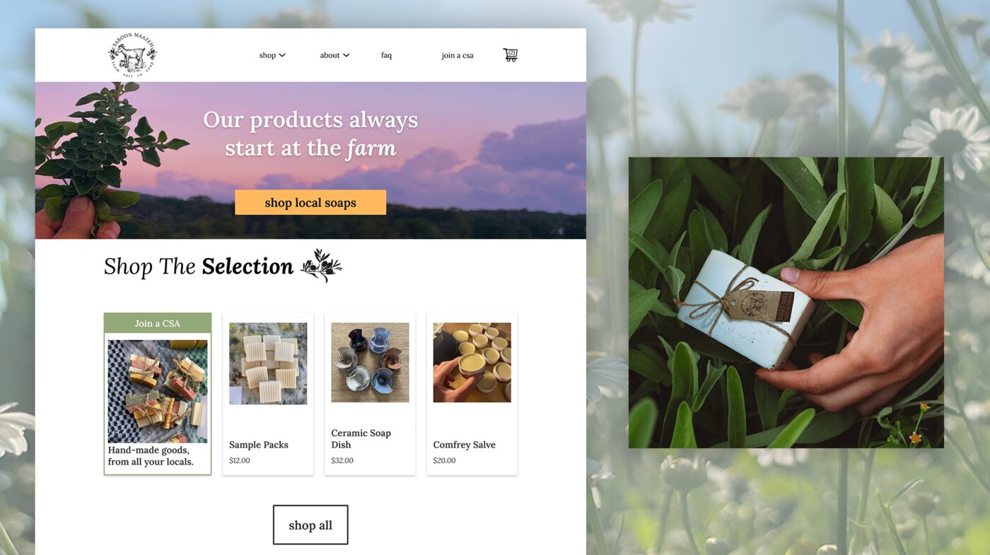
Contracted through Jiggli Media, I took the visual side of a full brand refresh for Saboon Maazeh — a small-batch, farm-to-soap brand that wanted to grow into retail and e‑commerce without turning into Generic Soap Company #4,000. The job: a new logo, an actual brand guide, and a complete Figma mockup and interactive prototype for the website — basically giving a handmade brand a proper suit that still smells like lavender.
Graphic & Web Designer (contract, via Jiggli Media)
Saboon Maazeh — homemade soap & skincare, B2C
Logo redesign, brand guide, Figma website mockup + interactive prototype, photo editing & asset optimization
Figma, Photoshop, Illustrator
Saboon Maazeh started as a genuinely small, farm-to-soap operation, and its founder wanted to grow into a wider retail and online audience without losing the thing that made the brand feel real in the first place — the handcrafted, small-batch story behind every bar. That meant the brand couldn't just get "prettier"; a glow-up alone doesn't cut it. It needed a visual identity, a website, and packaging that could hold up in a retail aisle and an online cart while still reading as authentic and personal, not mass-produced-with-a-farm-filter.
The scope covered three connected pieces: a refreshed brand identity (logo, color, type), a new e-commerce-ready website that could tell the brand's story as well as sell product, and eco-friendly packaging and print material for farmers'-market tables and events. My seat was the design layer underneath all three — the logo, the brand guide, and the Figma designs and prototype the website was meant to be built from.
Before I touched a single pixel, I did a little reconnaissance — looking at how other small, story-driven farm and homemade-goods brands were handling the exact same tension Saboon Maazeh was facing: stay authentic, but look retail-ready.
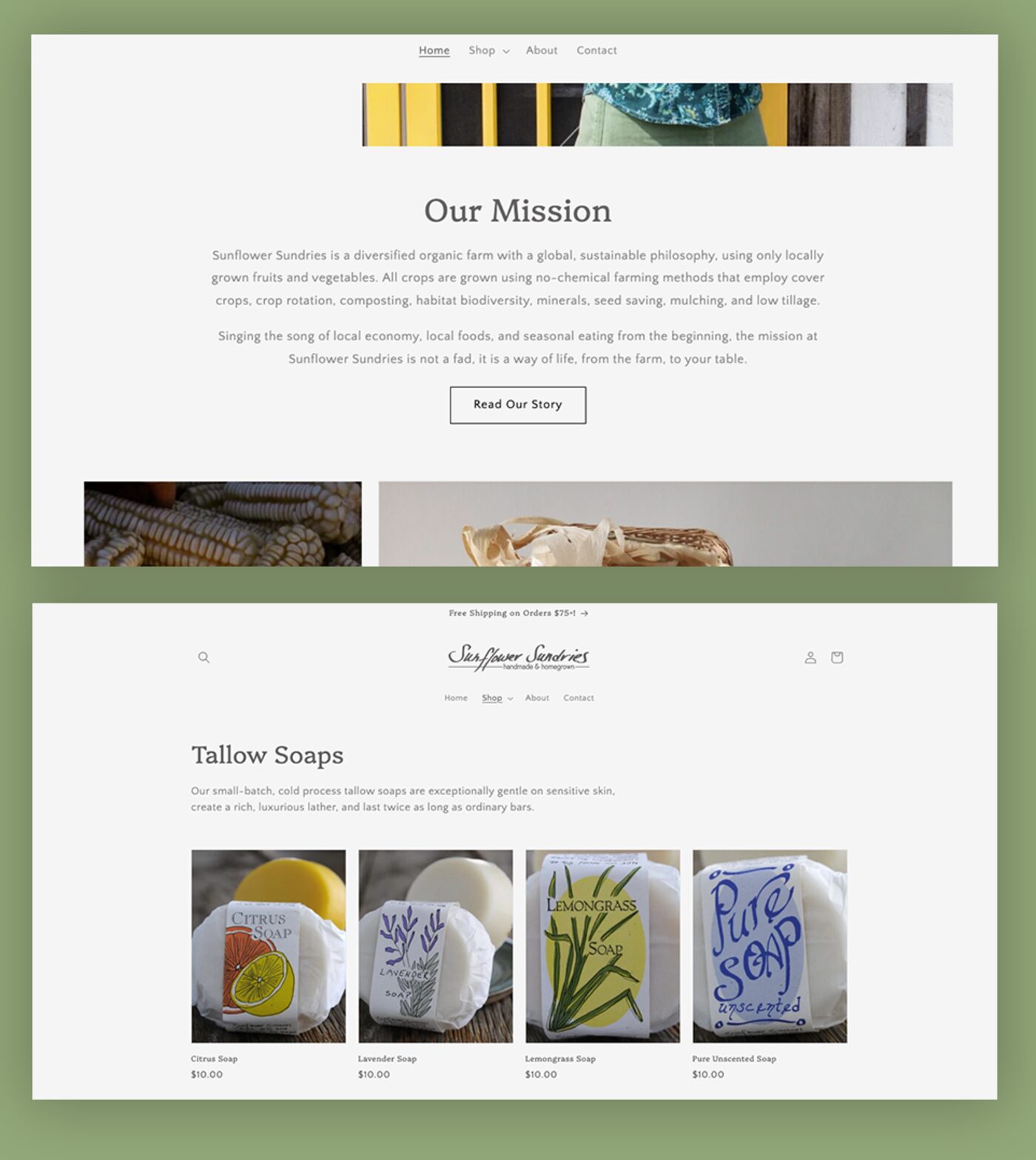
Sunflower Sundries is the closest direct comparable — homemade soap and heirloom goods from a Kentucky farm running since 1992. They lead with mission copy before a single product shows up, then drop into a clean, categorized shop grid backed by press logos for instant credibility. The soft spot: that mission copy runs a little long before the shop ever appears, which is exactly the kind of drag we tightened up for Saboon Maazeh.
Takeaway: put story before checkout, and organize products by category.
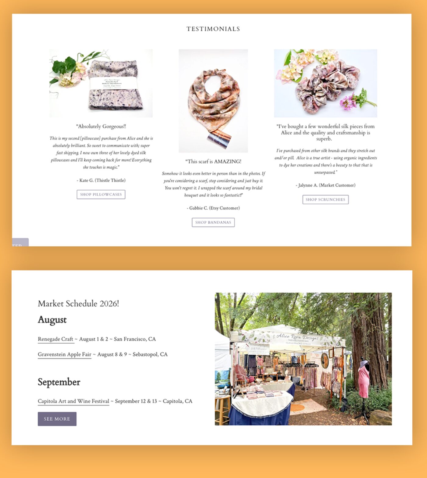
Alice Reva Designs makes handmade silk goods, also market-sold. Their dedicated market-schedule section is basically a direct parallel to Saboon Maazeh's farmers'-market print needs, and testimonials sit right next to the shop instead of exiled to their own page where nobody clicks.
Takeaway: keep trust signals — testimonials, market calendar — close to the purchase decision, not a click removed from it.
Also researched: Little Gem Farm — a single static page, no shop, with commerce handled entirely on Instagram. Takeaway: the site itself has to carry the story and the sale, not offload it elsewhere.
Also researched: Soul Fire Farm — a much larger nonprofit with deep, multi-level navigation on an older WordPress theme. Takeaway: keep navigation flat and the story on one guided path.
Overall: story-first, categorized-but-simple commerce, and trust signals placed close to the purchase decision — with flatter navigation than either Sunflower Sundries or Soul Fire Farm, since Saboon Maazeh's catalog didn't need that much structure yet.
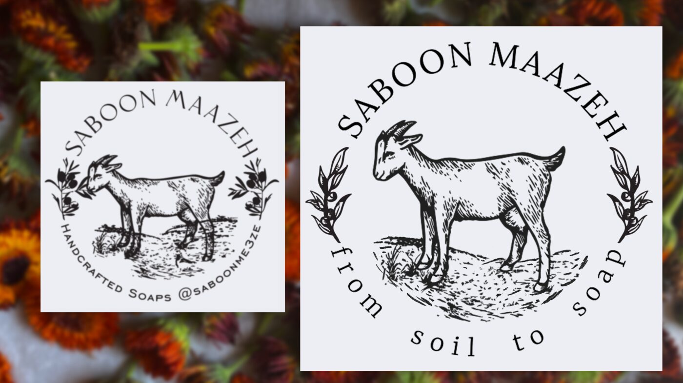
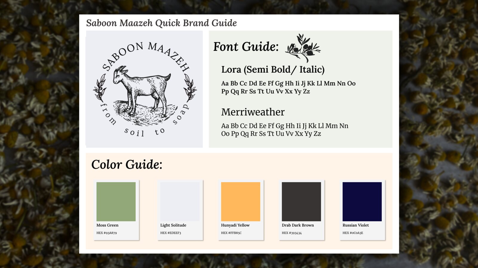
The direction: nature-inspired earth tones as the foundation, with a punchy accent color kept on a short leash for emphasis and calls to action — artisanal enough to feel handmade, controlled enough to feel like a business that ships orders on time. I refreshed the logo and dialed in the typography specifically for readability, so the mark holds up small (packaging, favicon, social) and large (signage, market banners) without turning to mush.
The final palette, straight from the brand guide: Moss Green (#93A879) and Drab Dark Brown (#393434) doing the heavy lifting as the earthy foundation, Light Solitude (#EDEEF3) as a clean neutral, and Hunyadi Yellow (#FFB85C) held in reserve for exactly the moments that need a little pop — buttons, badges, "buy this now" energy. Russian Violet (#0C0A3E) rounds it out as a deep accent for text and detail work. Paired it with Lora for display and Merriweather for body copy — readable, a little warm, nothing that screams "corporate."
Regular retail sales matter, but they weren't the real target. Saboon Maazeh's CSA subscriptions are meaningfully more profitable than one-off purchases, and local agriculture runs on a co-op dynamic — the more she promotes other area farms and CSAs, the more they promote her back. Soap on its own is a pretty saturated local market. So the site couldn't just sell product on its own merits; it needed to position Saboon Maazeh as part of that local farming network, so a bigger CSA's audience becomes her audience too. That's the real reason the site leads with story and relationships before it ever asks for a sale.
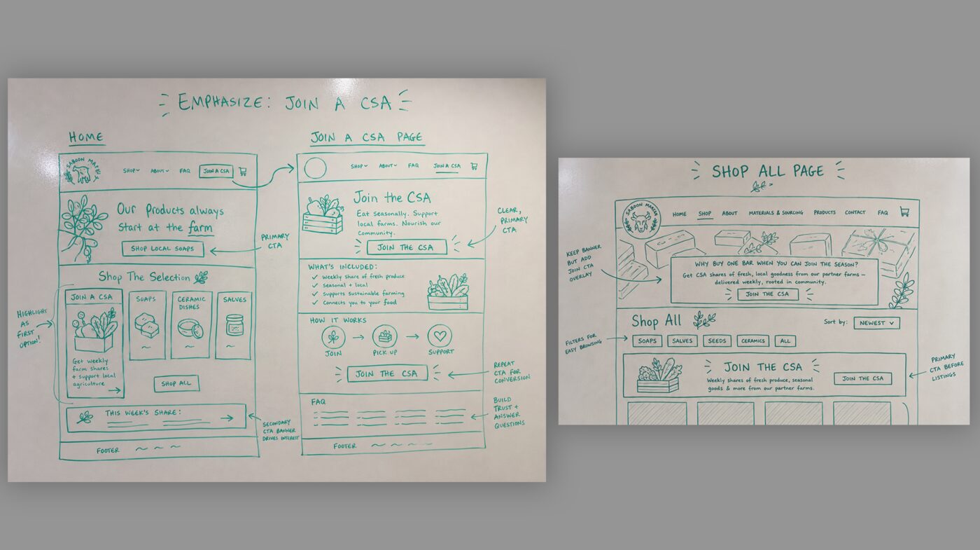
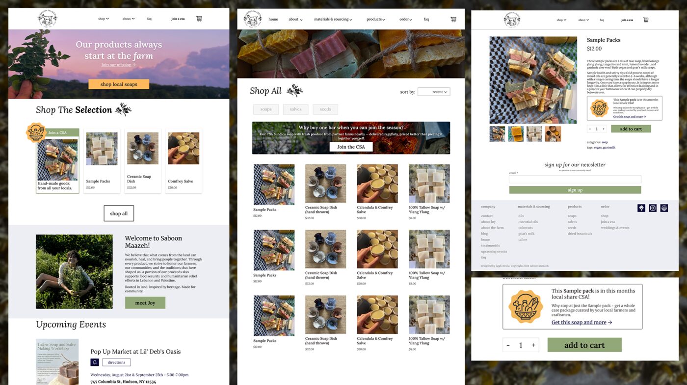
Called out on the homepage, given its own spot in the main nav, present on the shop-all page, and flagged with a small callout badge directly on individual popular items when that product was part of the current month's CSA box.
I designed the full site in Figma — mockup and interactive prototype — built around storytelling first, commerce second. The flow guides visitors through Saboon Maazeh's soap-making process and farm-grown ingredients before ever asking them to buy, then hands off into a straightforward e-commerce section with multiple payment options. Blog and events content gave returning, loyal customers a reason to keep coming back, not just first-time buyers.
I also edited and optimized every banner and photo asset used across the site — balancing image quality against load time, since a slow e-commerce site is a lost sale no matter how good the design looks.
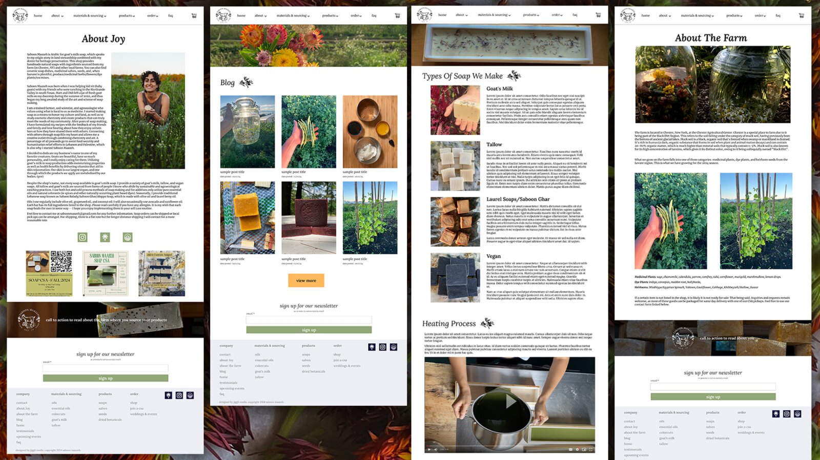
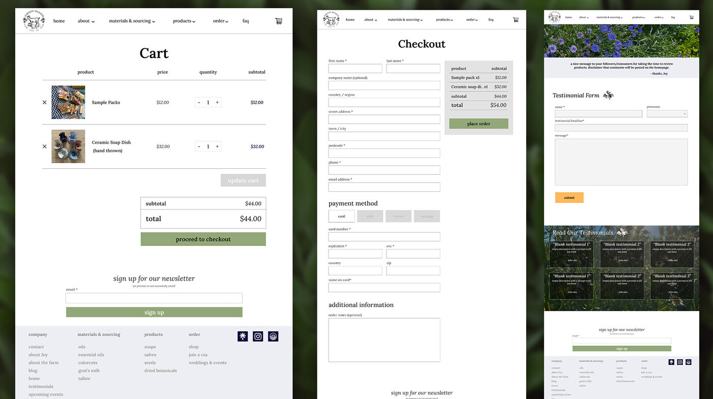
View the interactive Figma prototype →
Note: Saboon Maazeh ended up building the live site herself after handoff, so the site currently online doesn't reflect this design — the Figma file above is the accurate record of the work.
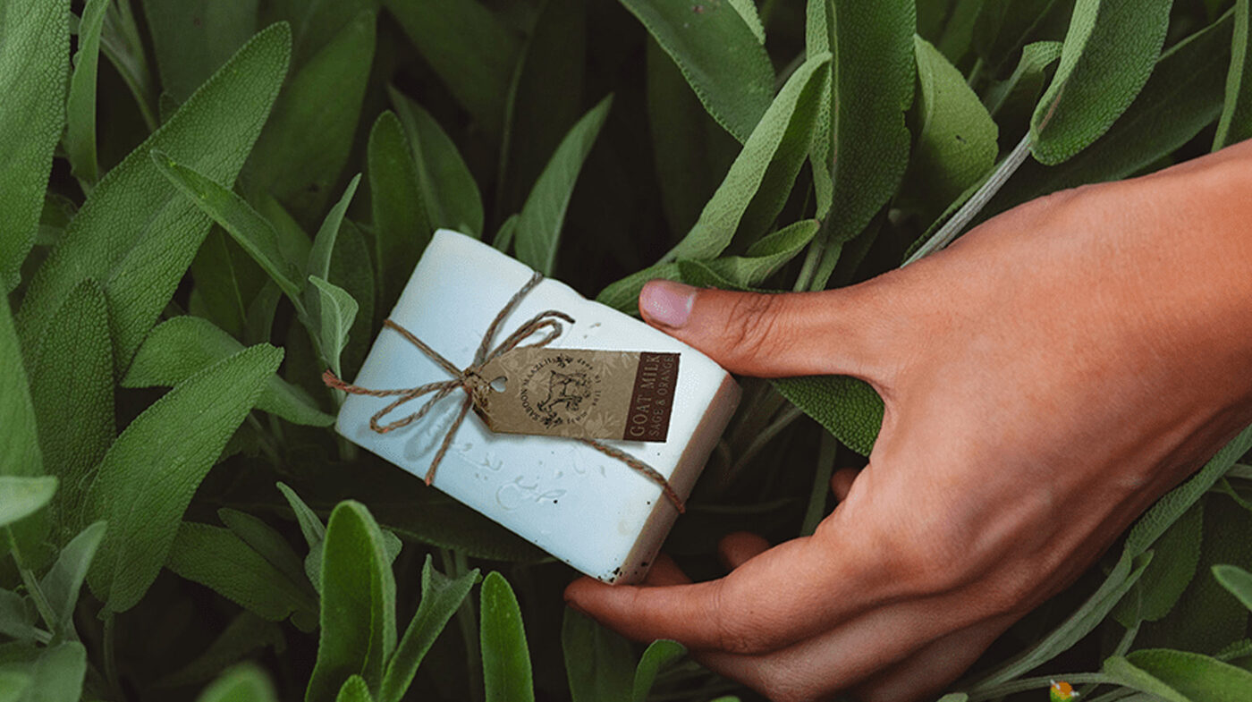
Packaging used eco-friendly, recyclable brown paper — a direct match for the brand's sustainable, handmade ethos — finished with natural textures and minimalist patterns that read as organic without looking unfinished. The same visual language extended into print materials for farmers' markets and events, so the brand felt consistent whether a customer met it online, in a retail aisle, or at a market table.
This was a contracted design engagement — I owned the identity, brand guide, and website design/prototype, then handed the final work to the client. Because of that, I don't have post-launch analytics tied specifically to my work the way I do for in-house projects, and I'd rather say that plainly than dress up numbers that aren't mine to claim.
What this project does show: the ability to get past surface-level branding and find the actual business lever underneath it — in this case, that CSA subscriptions mattered more to the client than one-off sales, and that a co-op relationship with other local farms was a more realistic growth path than duking it out in a saturated soap market. Landing on that took real research and process, not just visual instinct — competitive analysis of similar farm and homemade-goods brands, a whiteboarding session to work through where the CSA strategy should actually surface across the site, and a handful of design directions before landing on the final one. That process is as much a part of this case study as the finished design.
More broadly, this one's proof of a different skill than building a brand from zero: taking a client's existing, genuine story and scaling it up visually — across logo, web, and print — without flattening it into something generic.