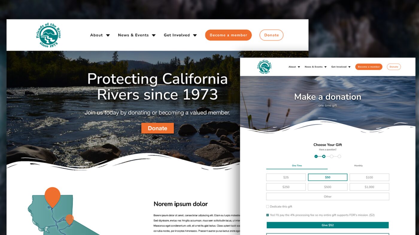
Friends of the River (FOR) has protected California's rivers since 1973. I started helping them freelance — through a connection from other nonprofit work — with small graphic design requests, which grew into a full donation portal redesign and build, plus brand and event materials along the way. This one's got charts, a snow globe, and an honest accounting of what actually shipped versus what stayed a very nice mockup.
Freelance Graphic & Web Designer
Friends of the River — CA river conservation nonprofit, since 1973
Freelance, connected through other nonprofit work — not through an agency
Donation portal design & development, event print collateral, holiday card illustration, SEO/AEO improvements
Figma, Illustrator, Photoshop, WordPress, HTML, CSS, JavaScript
This started small — a few graphic design favors for a nonprofit I actually respected — and grew from there. Three problems kept surfacing the more familiar I got with the site:
Part of this work was building an actual brand guide — expanding the color range beyond the original mark, standardizing type, and giving the team something to design consistently from instead of eyeballing it every time. Not every piece of this made it into the live site (the homepage and main nav kept much of their existing structure — more on that honesty later), but it shaped everything else I built for them, from the donation portal to their event materials.
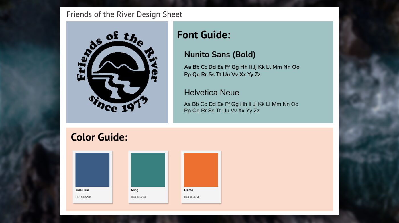
Yale Blue (#385A84) anchors darker UI and the footer, Ming (#367E7F) carries the primary brand teal used for CTAs and links, and Flame (#EE6F2E) is reserved for accents and highlights. All three show up throughout the donation portal redesign and the newer event materials below — even though this page itself sticks to my own site's colors.
The live homepage hadn't been touched in years — dense, dated, and carrying the same six-item nav and disconnected layout that made the old donation pages feel like three different websites wearing the same logo. I proposed a full redesign applying the expanded brand system above: simplified navigation, clearer visual hierarchy, and the river/wave motif carried through consistently instead of showing up once and calling it a day.
Honest flag: this is a proposal, not a shipped page — FOR kept the existing homepage structure live. It's included here anyway because it's the clearest single before/after of what the expanded brand system was actually meant to unlock.
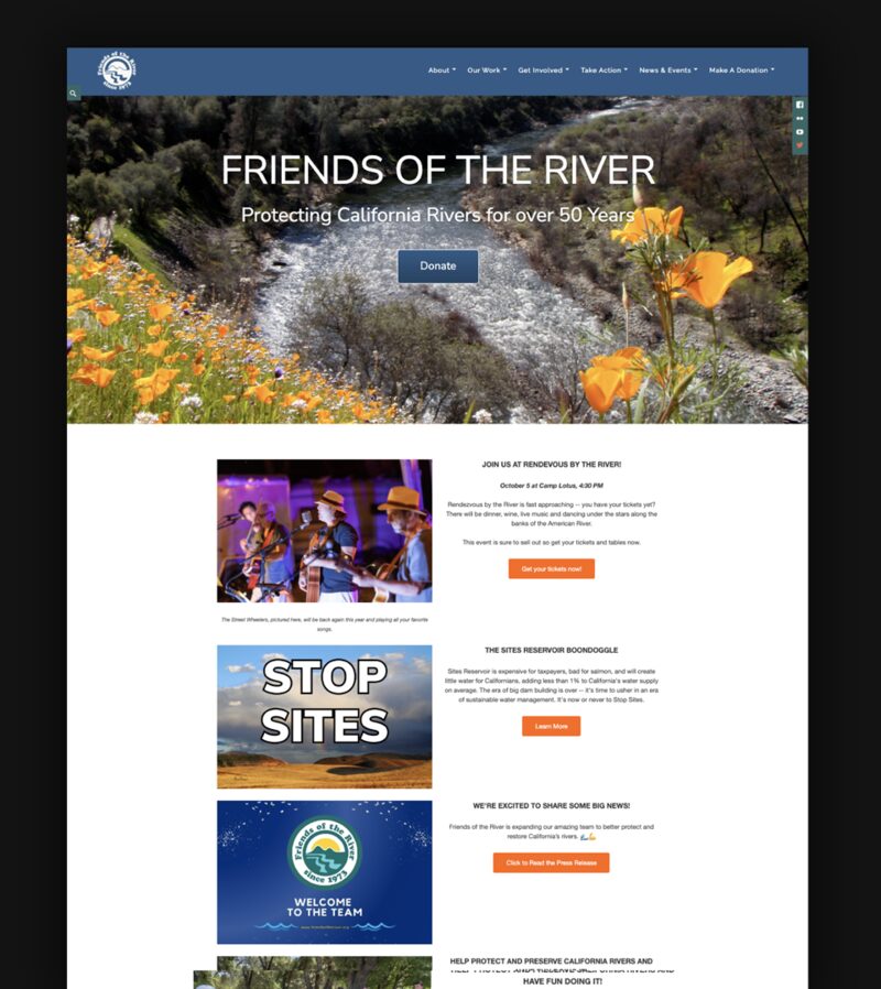 View full-size (long page) →
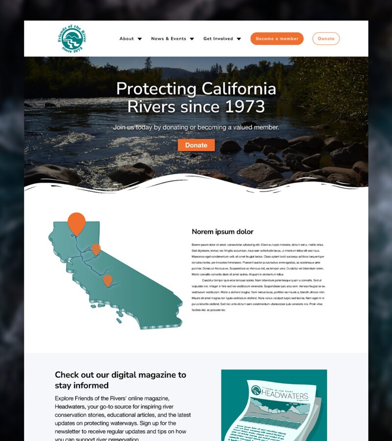 View full-size (long page) →
The relationship actually started here — small, freelance design requests that built enough trust before the bigger donation portal project ever came up. Nobody hands a stranger their entire fundraising infrastructure; you earn that with a good holiday card first.
A custom illustrated holiday card — a snow globe scene with a "RESIST" sign tucked into the snowy landscape, playing on both the season and FOR's advocacy identity at once. Cozy on the outside, still very much an environmental nonprofit on the inside.

FOR's annual gala fundraiser is their biggest night of the year, and its print materials hadn't kept pace with the brand. The old banner and postcard leaned on generic gala imagery — gold stars, a crescent moon, decorative clouds — none of which had anything to do with rivers, California, or the organization itself. Nice enough, could've been for literally any gala anywhere. The redesign swapped that out for California poppies (the actual state flower — a direct, specific tie to the mission), a wave pattern running through the background (the same river motif this section opened with), a consistent icon system for date/location/schedule, and a QR code linking straight to tickets.
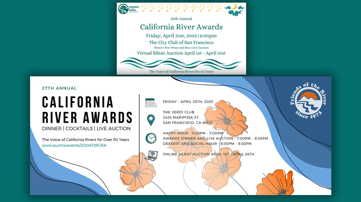
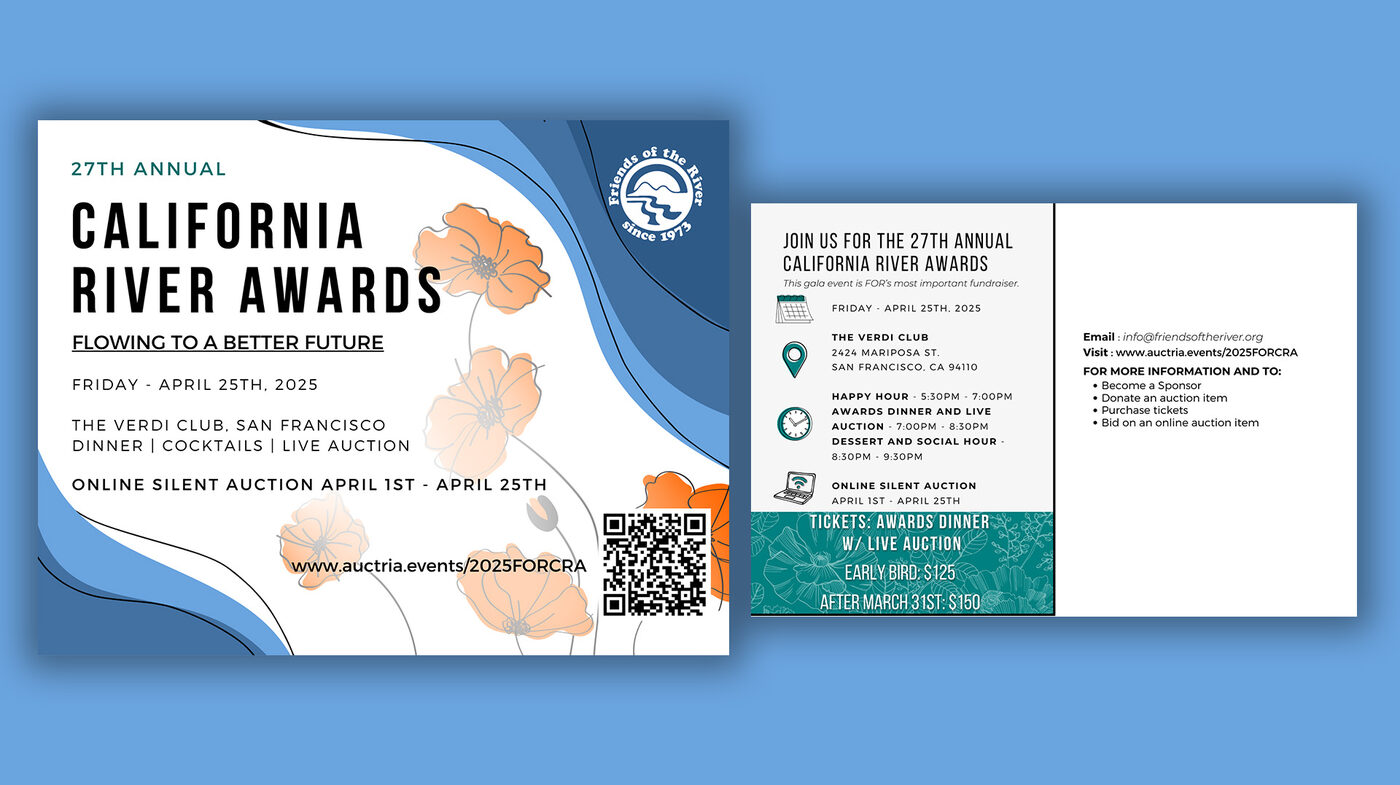
Takeaway: consistent, specific brand motifs — poppies, waves — beat generic "gala" decoration, and they tie the print materials back to the same visual language as the donation portal.
This was the core of the project: rebuilding how FOR asks for — and processes — donations. I owned both the design and the front-end development of the new portal, which is a nice way of saying I got very familiar with what makes people bail on a donation form.
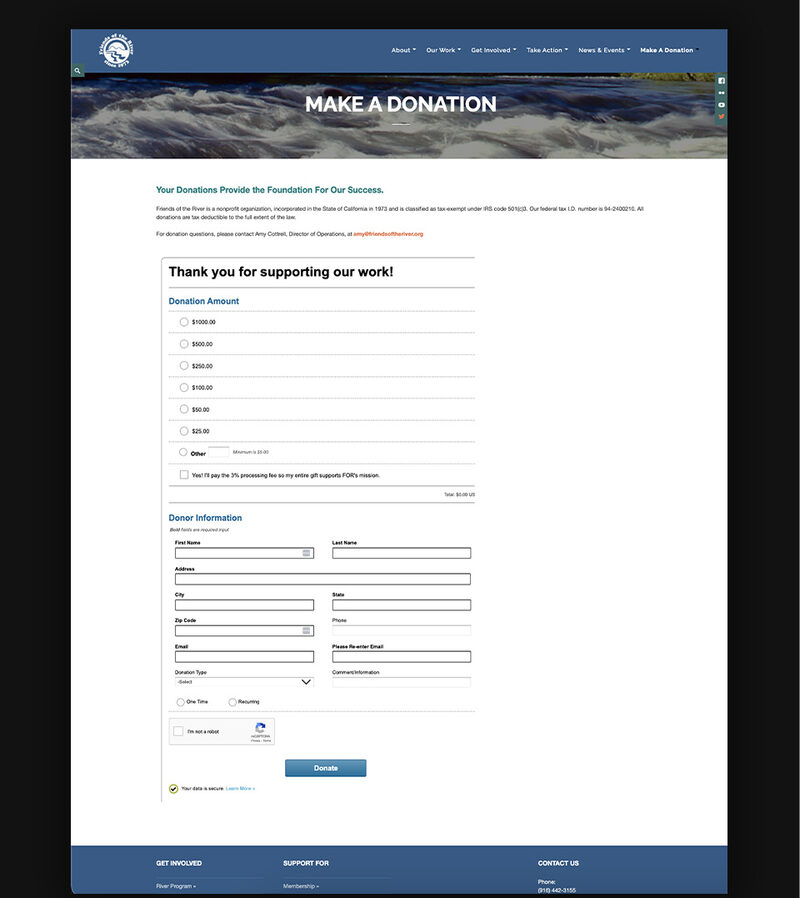
The old "Make a Donation" page put every field a donor could possibly need in front of them immediately — amount, full name, address, city, state, zip, phone, email (twice, for reasons unclear), donation type, comments, and a captcha — with zero separation between a quick one-time gift and setting up something recurring. It's the donation-form equivalent of a restaurant handing you the whole kitchen's inventory instead of a menu.
Worse, giving wasn't even contained to that one page. Other ways to support FOR — stock gifts, workplace giving, legacy gifts, retirement plan gifts, wills and trusts, becoming a member, becoming a sustaining monthly donor — were split across two more pages with completely different layouts and styles, like three separate teams had each been handed the brief without seeing each other's work.
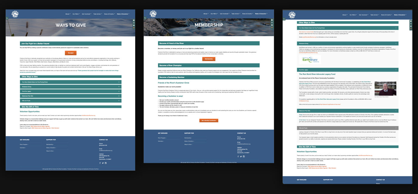
The old "Ways to Give" + "Membership" pages, once opened up, showed the same sprawl.
The redesign puts a One Time / Monthly tab choice front and center, with a step indicator so donors always know where they are in the process. Preset amounts replace open-ended radio lists, the processing-fee opt-in shows its exact dollar impact instead of a vague percentage, and the CTA button updates live to show the actual total being given. A secondary "Make it a monthly donation" button sits right under the primary CTA — the ask to go recurring happens at the moment of highest intent, not tacked on as an afterthought three screens later.
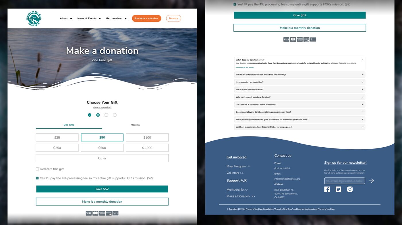 View full-size (long page) →
The Monthly tab is deliberately a different flow, not just a toggle — it opens with a "Thanks for giving Monthly!" delight message framed around impact ("helps us meet ongoing needs and plan for the future"), then collects name and email before amount, since recurring gifts need a billing profile a one-time gift doesn't. Small detail, but it means the monthly path never feels like a stripped-down version of the one-time path — it's built for what it actually is, not bolted on as an afterthought.
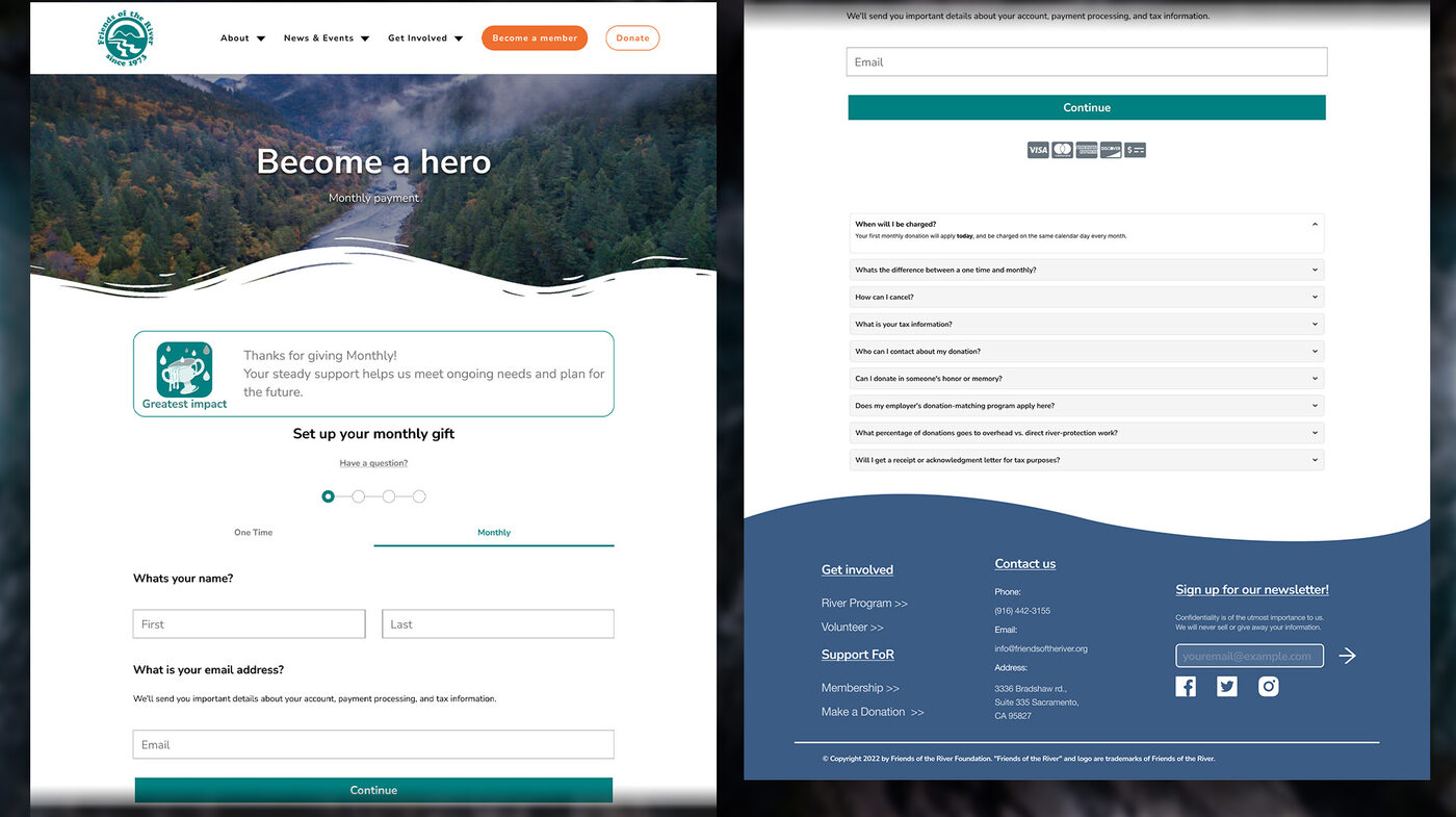 View full-size (long page) →
Both pages end with an accordion FAQ — tax deductibility, fee coverage, dedicating a gift, employer matching, overhead percentage, receipts — answered inline instead of sending donors hunting through the site or emailing to ask. The monthly page's FAQ is tailored differently ("When will I be charged?", "How can I cancel?") rather than reusing the one-time list, because those are the actual objections someone has right before committing to a recurring charge, not generic donation FAQs copy-pasted twice.
A few numbers back up the specific choices here. M+R's 2025/2026 nonprofit benchmarks put average donation-page conversion around 11% on desktop and 8% on mobile — and friction (too many fields, no recurring option, a clunky checkout) is consistently named as the main leak. Separately, a HubSpot study of 40,000 landing pages found conversion improved by nearly 50% just from cutting form fields from four down to three, which is the same direction as replacing a twelve-plus-field form with a tabbed, staged flow. And the push toward monthly giving specifically isn't just a revenue-smoothing move: monthly donors retain at roughly 83.6%, compared to about 45.2% for one-time donors — so a design that nudges toward recurring gifts is also a design that quietly builds a more stable donor base over time, not just a bigger one-time number.
The donation portal is live, and plenty of the surrounding recommendations got incorporated even where they weren't adopted wholesale — but FOR didn't implement every piece of the broader redesign. The homepage and main navigation kept their original structure rather than the fully decluttered version I proposed. I'd rather say that plainly than let this page imply the whole site reflects this work.
I don't have controlled before/after conversion data — this was freelance work without an analytics handoff — but a quick traffic pull after implementation showed a clear upward trend. Rather than just re-posting that screenshot like it's a trophy, here's what it actually shows:
"Prior month" is back-calculated from the reported percentage change, not a number read directly off the report — flagged here rather than presented as a precise figure.
Including the less flattering numbers on purpose: a 69.24% bounce rate and 31-second average visit alongside the traffic growth is a more honest picture than only showing the metric that moved in the right direction. This is a single month-over-month snapshot, not a controlled before/after study, and I can't isolate how much of the lift is tied to the donation portal specifically versus other factors (SEO/AEO work I also did during this refresh, seasonal giving patterns, event promotion). Presented as a directional signal, not a proven causal result.
The live donation page is at friendsoftheriver.org/make-a-donation → — it differs slightly from the exact designs above since not every recommendation was adopted, but it's a real, working improvement over what existed before, which is the part that actually matters.
This project grew organically — small design favors that built enough trust to take on the harder, higher-stakes work of rebuilding how a nonprofit asks people for money. That's a different kind of relationship than a contracted agency engagement, and it required a different kind of patience: not every recommendation gets adopted on a nonprofit's timeline or budget, and the work still has to be worth doing even when you know going in that some of it might not ship.
It's also a good example of connecting a UX decision (separating one-time from monthly giving) to an organizational goal (donor retention) rather than treating it as a pure design preference. The tabbed flow isn't there because it looks cleaner — it's there because recurring donors are worth roughly twice the retention of one-time donors, and the page now asks for that commitment at the exact moment someone's already decided to give.